
🔥 Would you like to save this?
A hotel bathroom the size of a parking space has no business feeling open. Yet you walk into the good ones and your shoulders drop. The room breathes, and you can’t quite say why. That’s the point. The best designers don’t add square footage because they can’t, so they fool your eye instead. Mirrors do the heavy lifting, glass refuses to block a sightline, and the floor runs edge to edge without a single interruption to tell your brain where the room ends. We pulled ten tricks that keep showing up in rooms living far larger than their blueprint says they should.
43. A Full-Wall Mirror Visually Doubles the Room
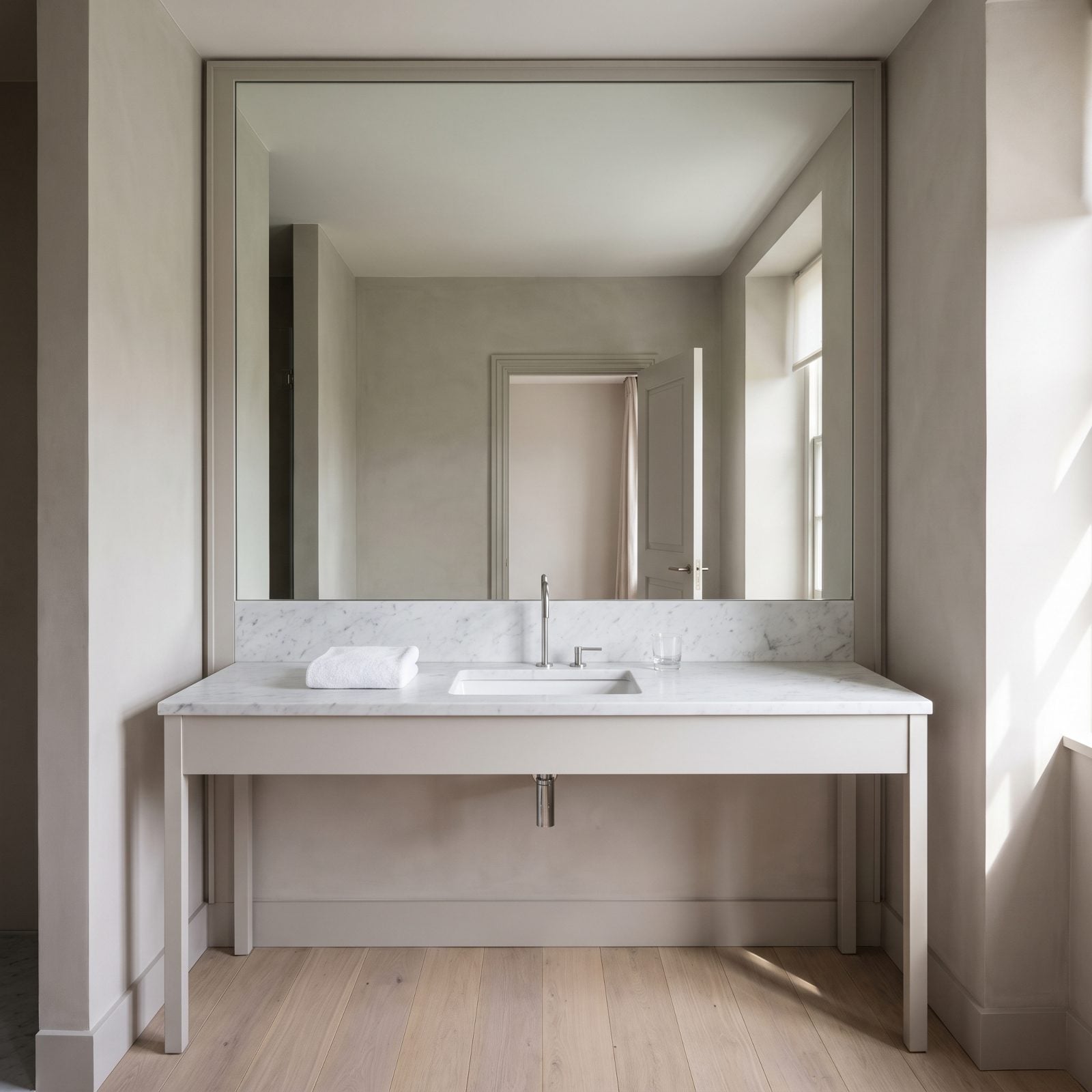
The oldest trick, and still the best. A mirror that runs the full wall, floor-to-ceiling or at least counter-to-ceiling, hands your brain a second room that doesn’t exist, and the reflection is so complete there’s no frame to break the illusion.
Here’s the part nobody mentions: it only works if the mirror reflects something worth seeing. A full-wall mirror facing a cluttered towel rail just doubles the mess. Point it at a window, a clean wall, or down the length of the room, and the space seems to keep going.
42. A Frameless Glass Shower Keeps the Full Room Visible
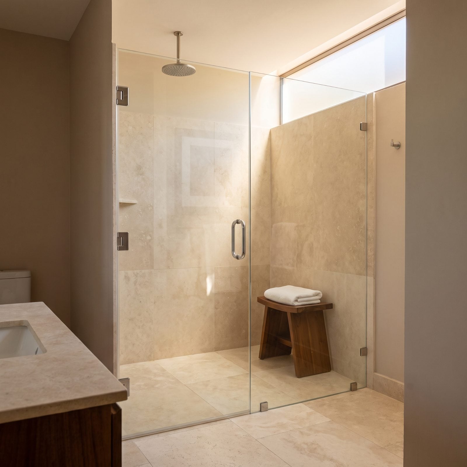
Swap a shower curtain or a framed enclosure for frameless glass and the room instantly reclaims every inch behind it. Your eye travels straight through to the far wall instead of stopping at a barrier.
A curtain announces that the room ends here. Framed glass with thick metal edges draws a box around the shower and shrinks everything inside and around it. Frameless glass does the opposite — present for the water, invisible for everything else.
41. A Floating Vanity Makes the Floor Continue Beneath It
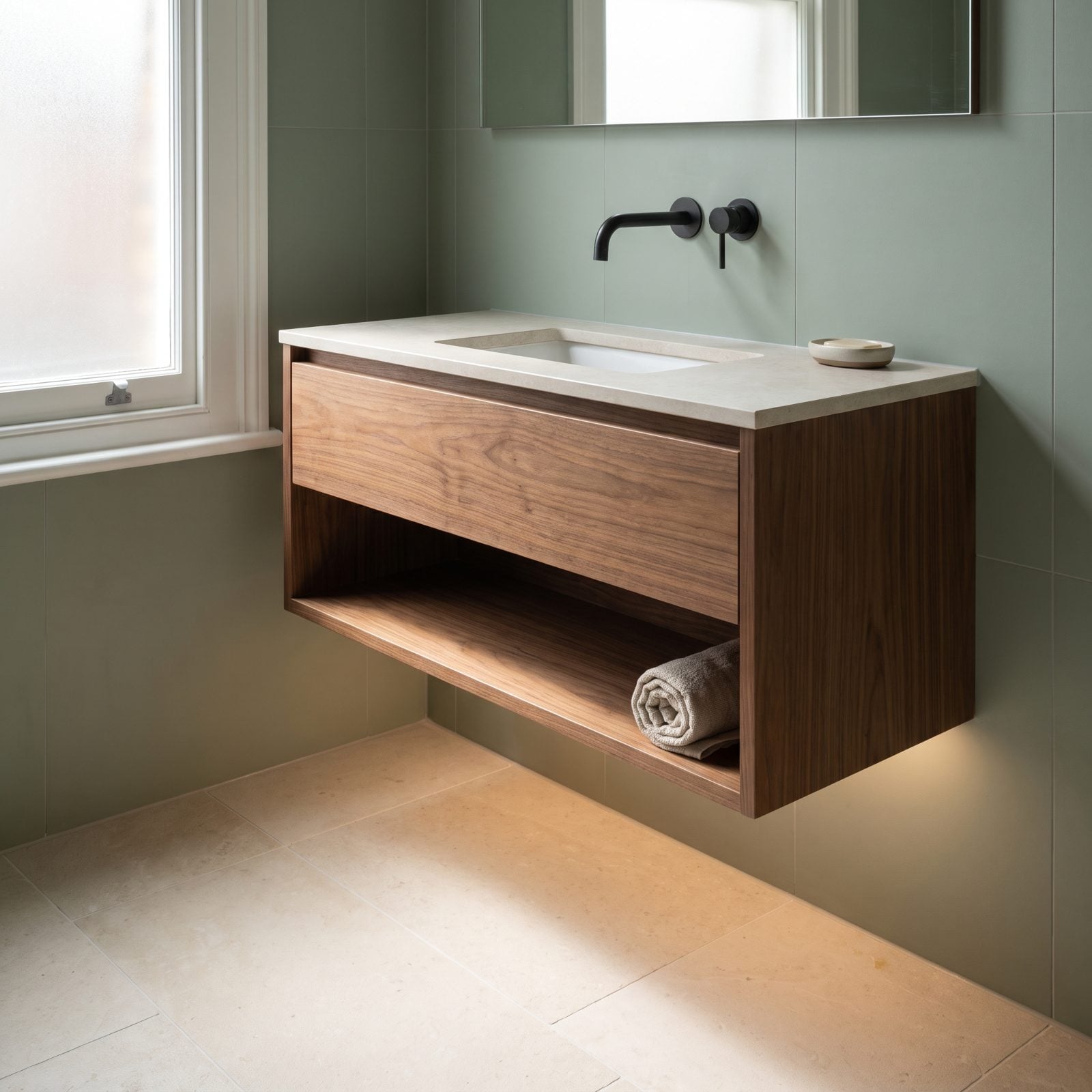
Mount the vanity to the wall with daylight showing beneath it, and the floor sails right under. A cabinet planted on the ground cuts the floor in two and announces exactly how little there is to go around. Lift it, and the eye reads one unbroken plane.
Add a strip of warm LED in the gap underneath and the whole cabinet seems to hover. The shadow does as much work as the light.
40. A Curbless Shower Extends the Floor Uninterrupted
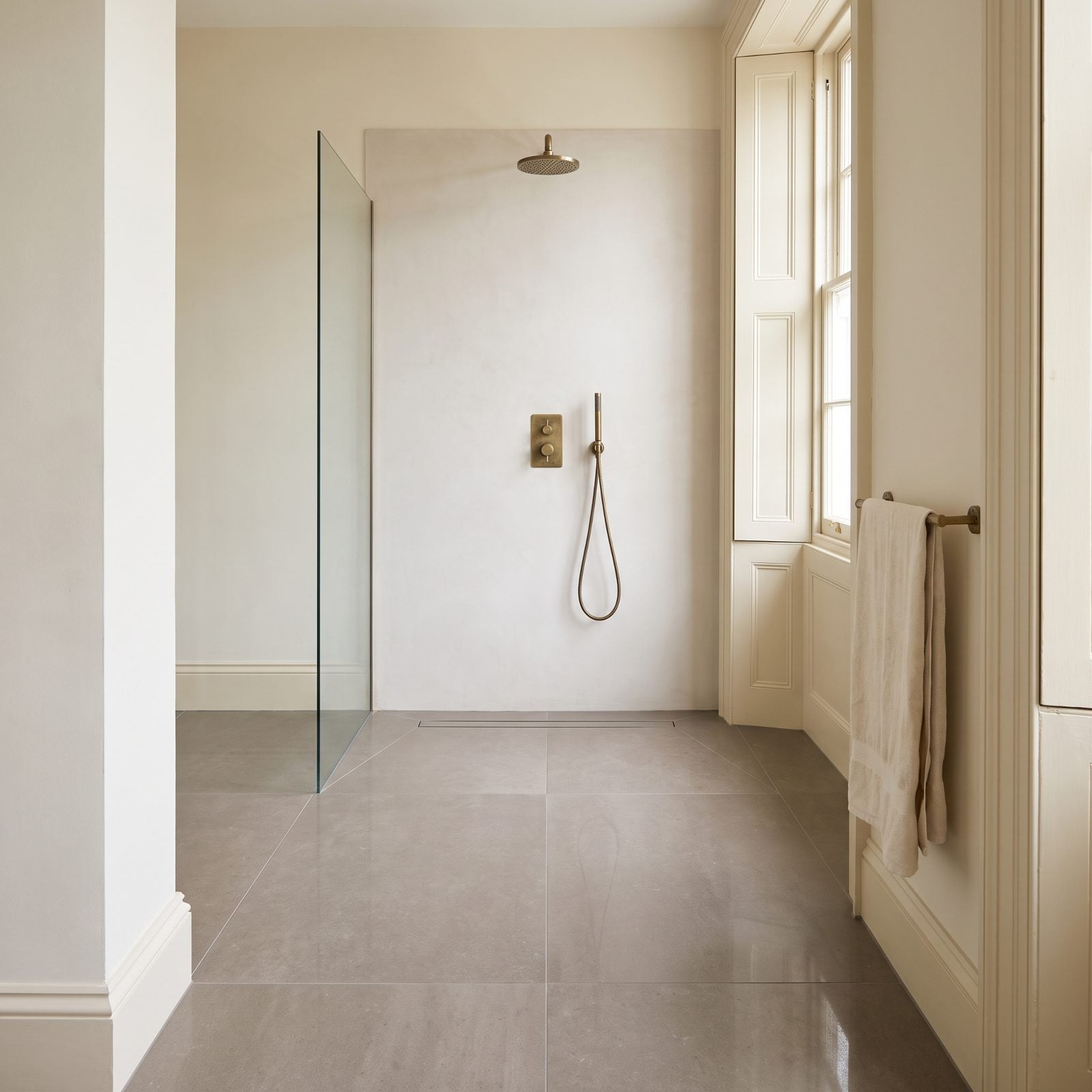
No curb, no step, no lip. The shower floor and the bathroom floor are one surface, drained by a slim linear channel tucked against the wall, and nothing tells your eye where the dry room stops and the wet room starts.
A raised shower tray or a tiled curb chops the floor into zones, and every zone reads smaller. Level the whole thing and the footprint feels generous, even when it isn’t. Bonus: nothing to trip over at six in the morning.
39. A Wall-Hung Toilet Reveals More Floor
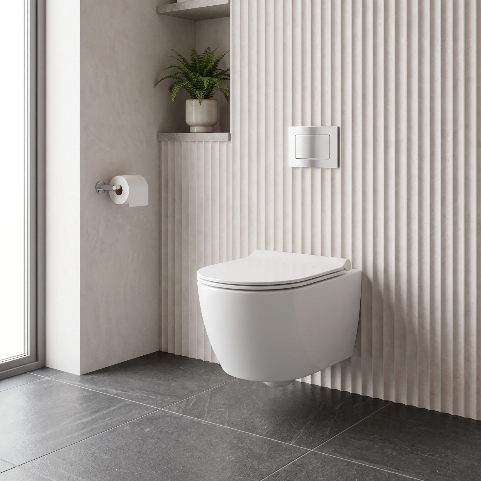
Hide the tank inside the wall, hang the bowl off it, and you expose a strip of floor that a standard floor-mounted unit buries. The fixture looks lighter and the room reads less cluttered around it.
The concealed cistern frame costs more to install and demands a thicker wall behind it — people forget that part. But the payoff is real: continuous floor under the fixture, easier cleaning, and a fixture that stops hogging visual weight in a room that can’t spare any.
38. A Glass Interior Wall Borrows Light From the Bedroom
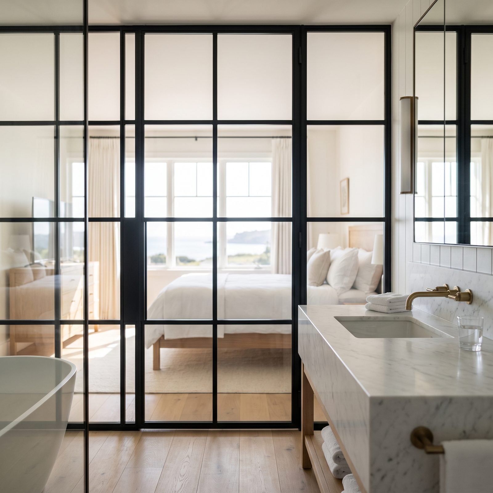
Most hotel bathrooms are interior boxes with no window at all. A glass interior wall fixes that by stealing daylight from the bedroom next door, and suddenly a windowless room has brightness it had no right to.
Crittall-style black steel frames are the fashionable version, but a plain glass panel does the same job. Want privacy? Electric smart glass goes opaque at the flip of a switch — clear when you want the light, frosted when you want the wall. Light and depth, both at once.
A windowless room borrowing a window’s light is the closest thing to free square footage a designer gets.
37. A Pocket Door Recovers the Door-Swing Area
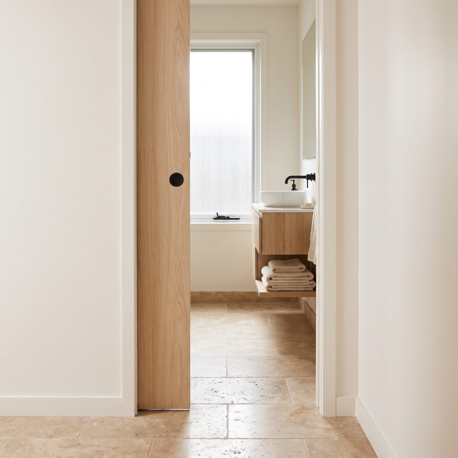
A swinging door needs a clear arc of floor it uses for maybe two seconds a day and sterilizes the rest of the time. A pocket door slides into the wall cavity and gives that whole arc back.
In a bathroom this tight, the swing zone is often the only spot you could stand comfortably. Reclaim it and the room gains usable space that was always there, just held hostage by a hinge.
36. A Mirror Facing a Window Multiplies Daylight
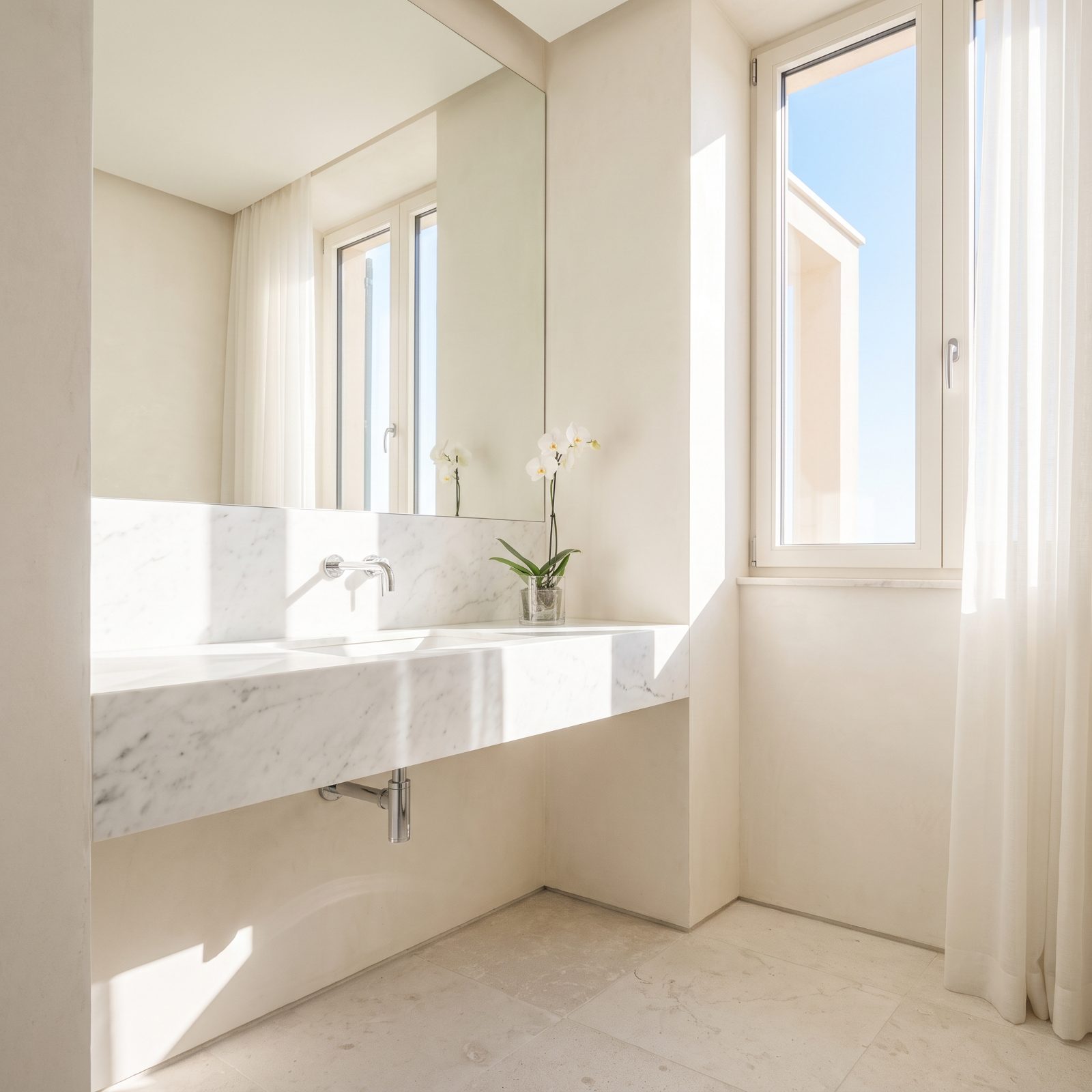
Put a mirror opposite a window and it throws the daylight back across the room, roughly doubling what you get from one source. A dim bathroom brightens without a second fixture.
It also catches the view, or at least the sky, so the mirror shows something alive instead of another wall. Bright rooms always read bigger than dark ones. That’s half the illusion right there, and the cheapest half.
35. A Mirror Wrapped Around a Corner Erases the Boundary
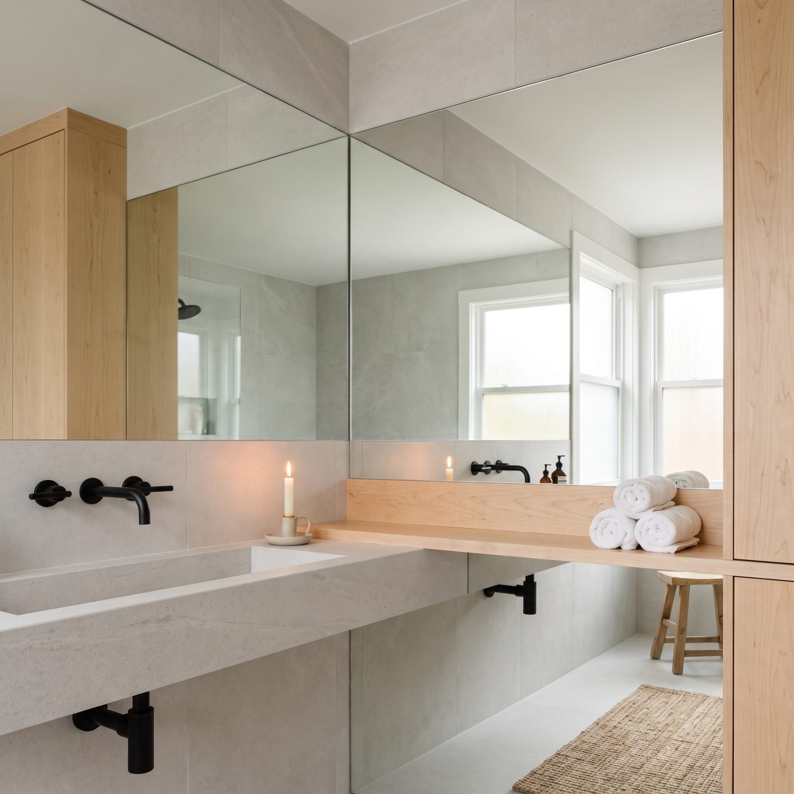
Run mirror around an inside corner with no break at the junction, and the two walls stop meeting. Your eye can’t find the corner, so the room loses its edge entirely and seems to open sideways into nowhere.
This one beats a flat mirror because corners are how your brain measures a room’s limits. Remove the visible corner and you remove one of the boundaries it uses to size the space.
34. Large-Format Floor Tile Reduces Busy Grout Lines
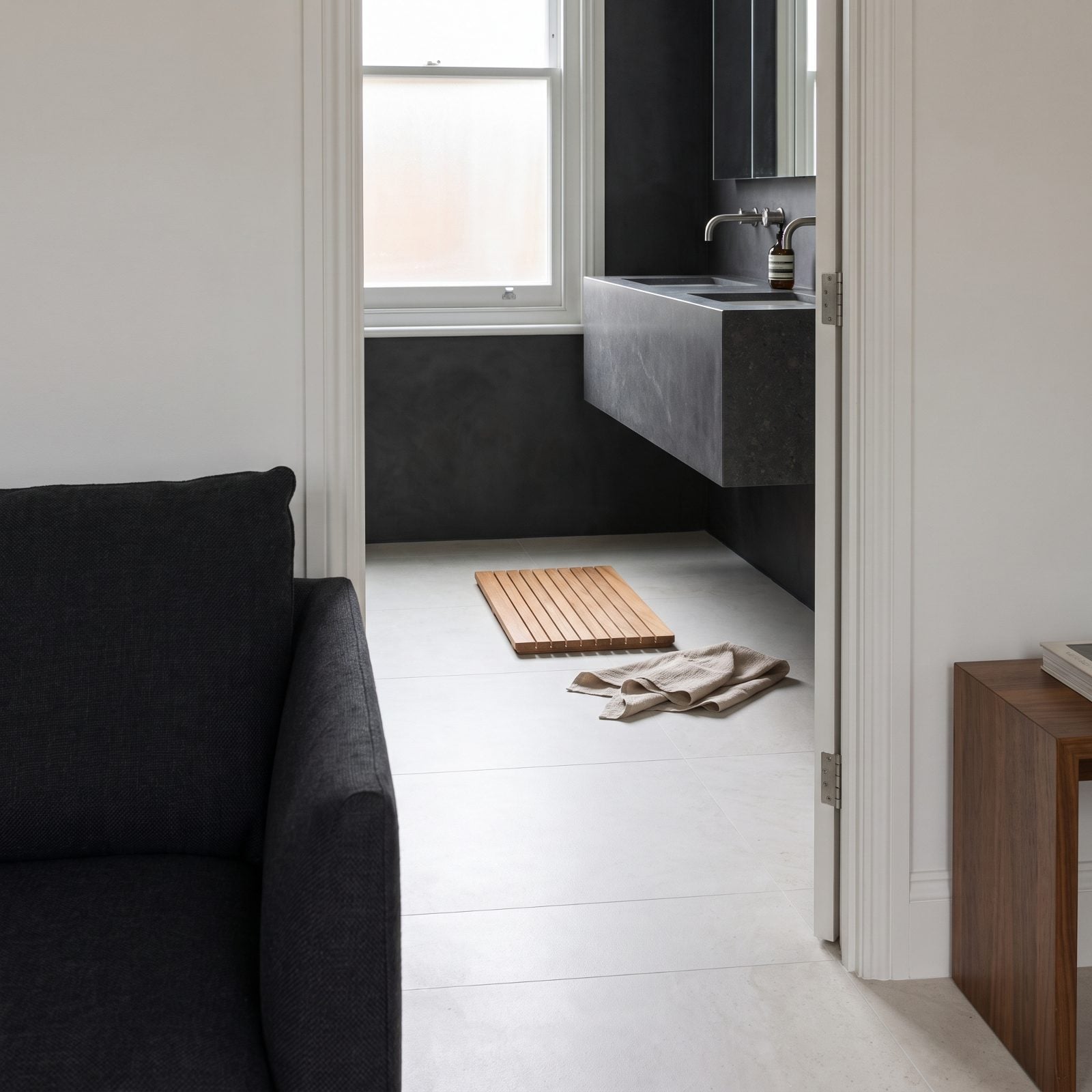
Small mosaic tile covers a floor in a grid of lines, and every line is a tiny visual interruption your eye has to cross. Dozens of them read as busy, and busy reads as small.
Switch to large-format slabs with grout matched to the tile color and the lines all but vanish. The floor becomes a near-continuous plane, which is exactly what the eye wants in a room fighting for a sense of size. Fewer lines, calmer floor, bigger room. The last trick on the list, and maybe the most overlooked of the bunch.
33. Matching Floor and Shower Tile Pulls the Eye Straight Through
🔥 Would you like to save this?
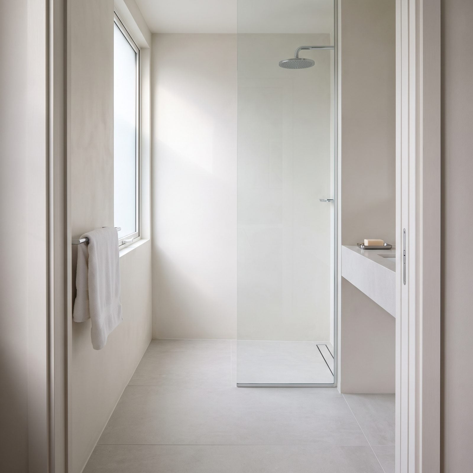
Change the tile at the shower line and you’ve just drawn a wall on the floor. The eye stops dead at the color break. Run the same large-format tile from the vanity straight into the shower, skip the threshold, use a flush linear drain, and the floor reads as one surface that keeps going.
Big tiles beat small ones here because fewer grout lines mean fewer visual speed bumps. A 24-inch tile in a tiny room sounds backward, but the lack of chopping is exactly what stretches the space.
32. A Wet-Room Layout Throws Out the Interior Walls
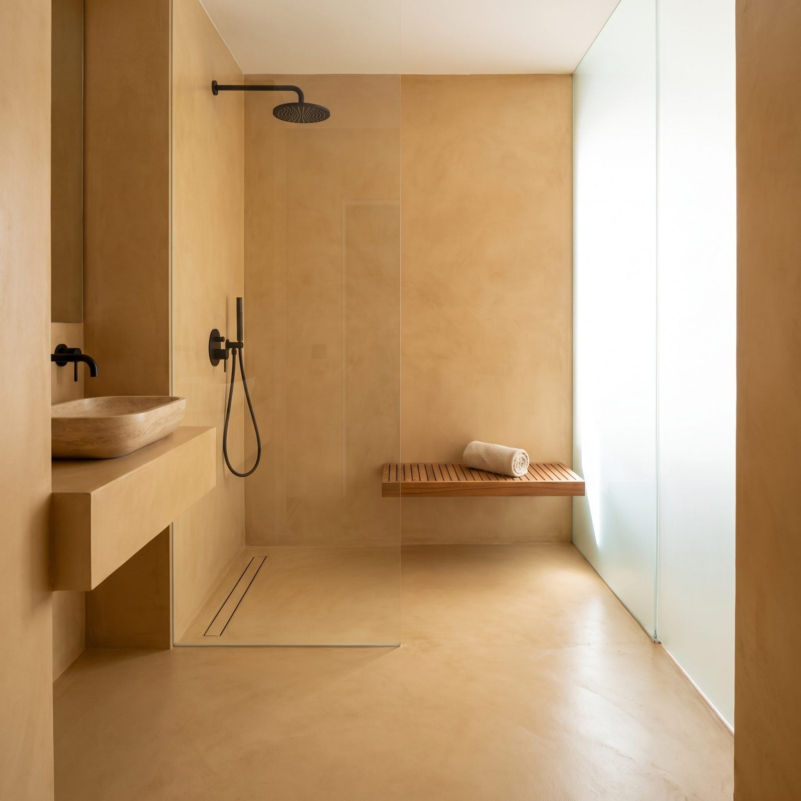
The fastest way to make a small bathroom bigger is to take the shower box out of it. A wet room waterproofs the whole floor and lets the shower share space with everything else. No curb, no glass door swinging into your shins, no little tiled cubicle eating a corner.
The catch nobody mentions: you need proper slope and real waterproofing, or you’ve built a very expensive puddle. Hotels get this right because they do it all day. In an older property it’s often the only move that fits a shower in at all, which is why you see it so much in converted townhouses.
31. A Skylight Hands the Room an Extra Ceiling
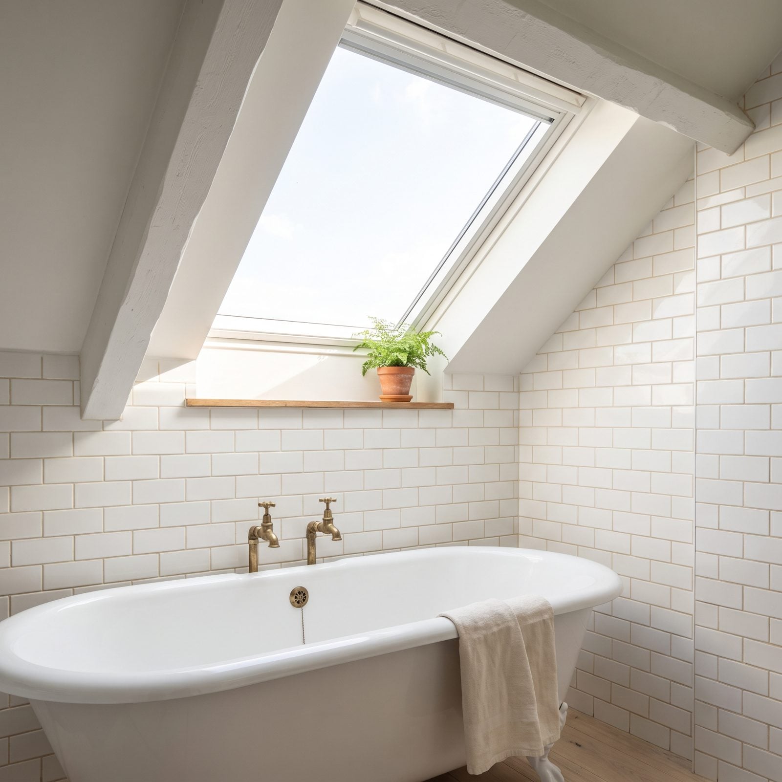
A window gives you a view. A skylight gives you sky, and sky has no measurable edge. Drop one into a small bathroom and the ceiling stops being a lid — the eye travels up, the room feels taller, and the whole space fills with that even overhead light no fixture ever quite matches.
Top-floor rooms and attic conversions lean on this hard. I’d take a skylight over a wall sconce any day. The light shifts through the hours, which keeps the room from feeling static.
30. A Tub Set Across the Back Wall Stretches the Room Wide
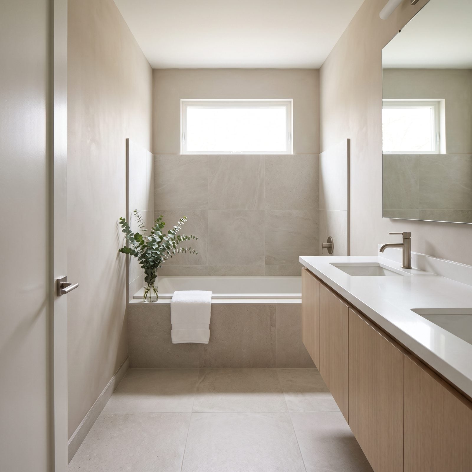
Put the tub along the back wall, running the full width, and the far end of the room becomes a single clean line. Nothing juts into the floor. The eye reads the back wall as the room’s true width because the tub reinforces it instead of fighting it.
This is the standard-issue move in narrow bathrooms, and it earns its keep. A tub stuck sideways in the middle of a small room is a knee-banger and a space-eater. Pushed flat against the end, it disappears into the architecture.
29. A Corner Shower Clears the Middle of the Floor
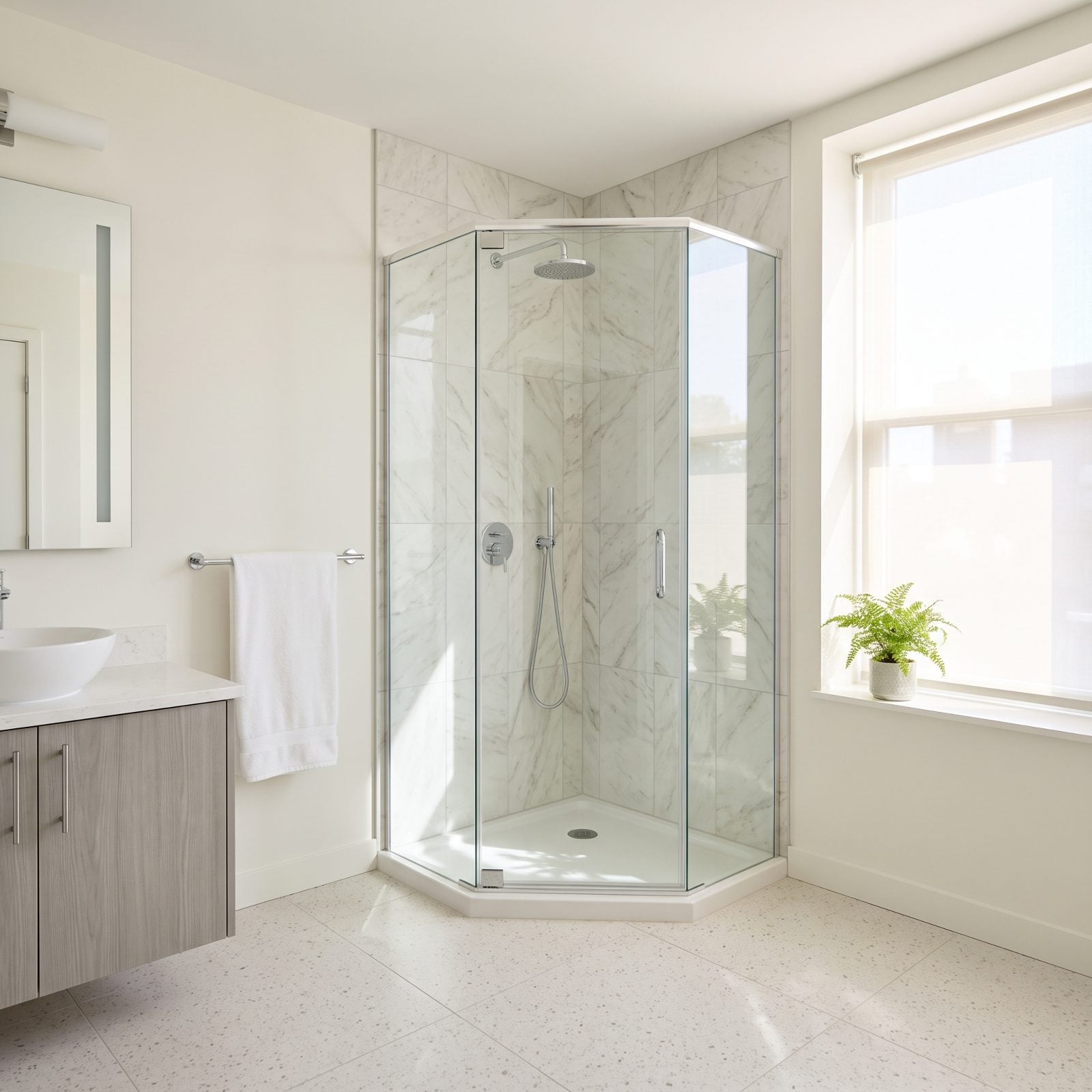
Corners are the junk drawers of a bathroom. A shower belongs there. Tuck a frameless neo-angle enclosure into the far corner and you reclaim the center of the floor, which is the part your eye actually reads as “the room.”
Frameless glass does the quiet work. A framed door draws a bold rectangle; frameless glass nearly vanishes, so the open floor and the shower floor read as one. Center space registers as roominess — total square footage doesn’t.
28. A Freestanding Tub Leaves Floor Visible Around Its Feet
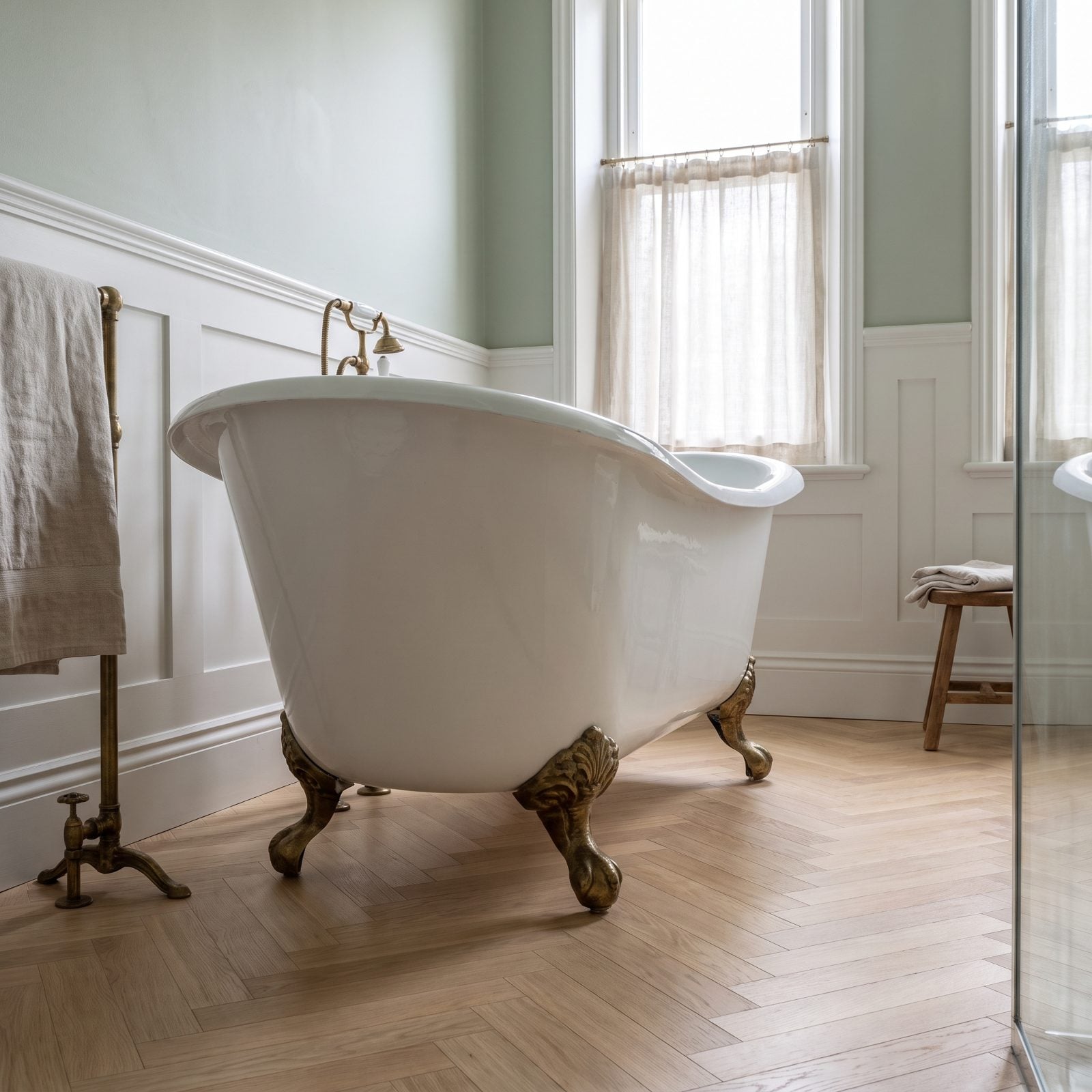
Here’s the counterintuitive one. A freestanding tub takes up more actual volume than a built-in, yet it can make the room feel larger. The reason is the floor you can see running underneath and around it.
A built-in tub lands on the floor like a block. A freestanding tub floats above it on feet or a slim base, and that visible strip of floor reads as continuous space. Your eye follows the floor past the tub instead of hitting a wall of tile.
It only works if the room can spare a little breathing room on the sides. Jam a freestanding tub wall to wall and you lose the whole effect.
27. A Shallow Vanity Saves the Steps You Actually Take
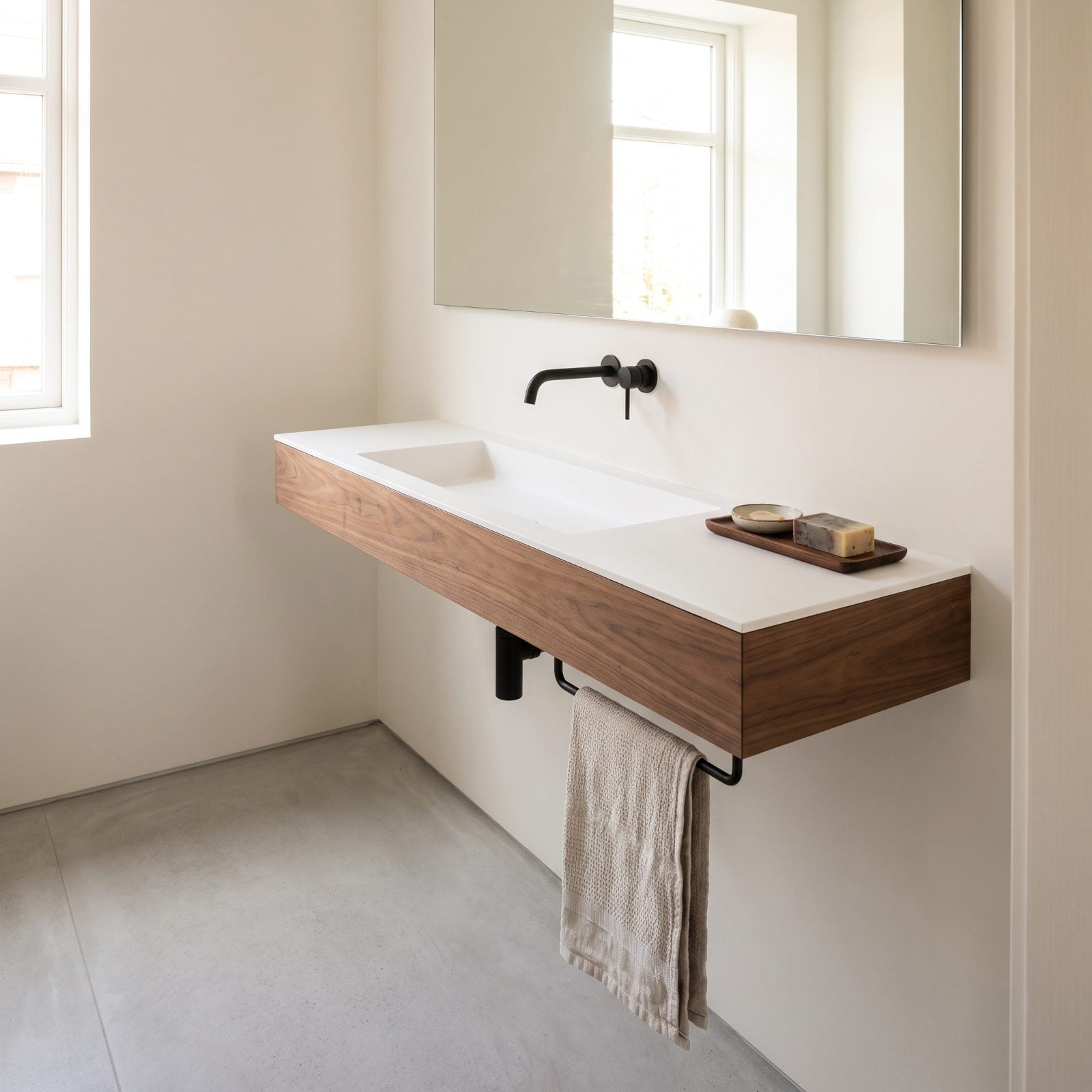
A standard vanity is deeper than you need. You don’t lean your whole body into the counter — you use the front edge. Shave a vanity down to 14 or 15 inches and it gives back the inches right where you walk.
In a narrow bathroom those inches are the difference between squeezing past and moving freely. Hotels pair a shallow top with a narrow trough basin so the sink doesn’t force the counter back out. Less projection, same function, more walking room.
26. A Vessel Sink Lets the Counter Go Slim
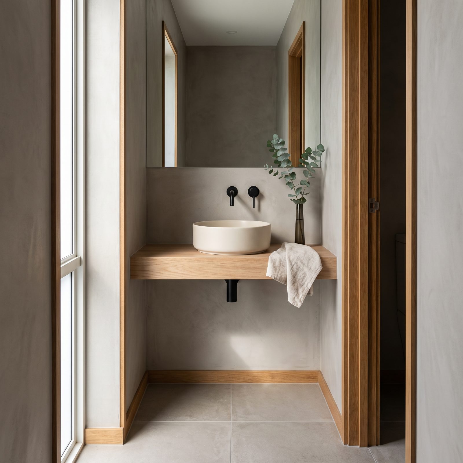
A drop-in sink needs a counter wide enough to hold it. A vessel sink sits on top, so the slab underneath can shrink to a sliver. You get a working basin on a counter barely deeper than a shelf.
The bowl sitting proud of the surface keeps the whole arrangement light and open underneath. Honestly? I find some vessel sinks fussy to clean around the base. But in a tight room the space they buy back is worth the wipe-down.
25. Recessed Medicine Cabinets Store the Stuff Without Stealing the Air
🔥 Would you like to save this?
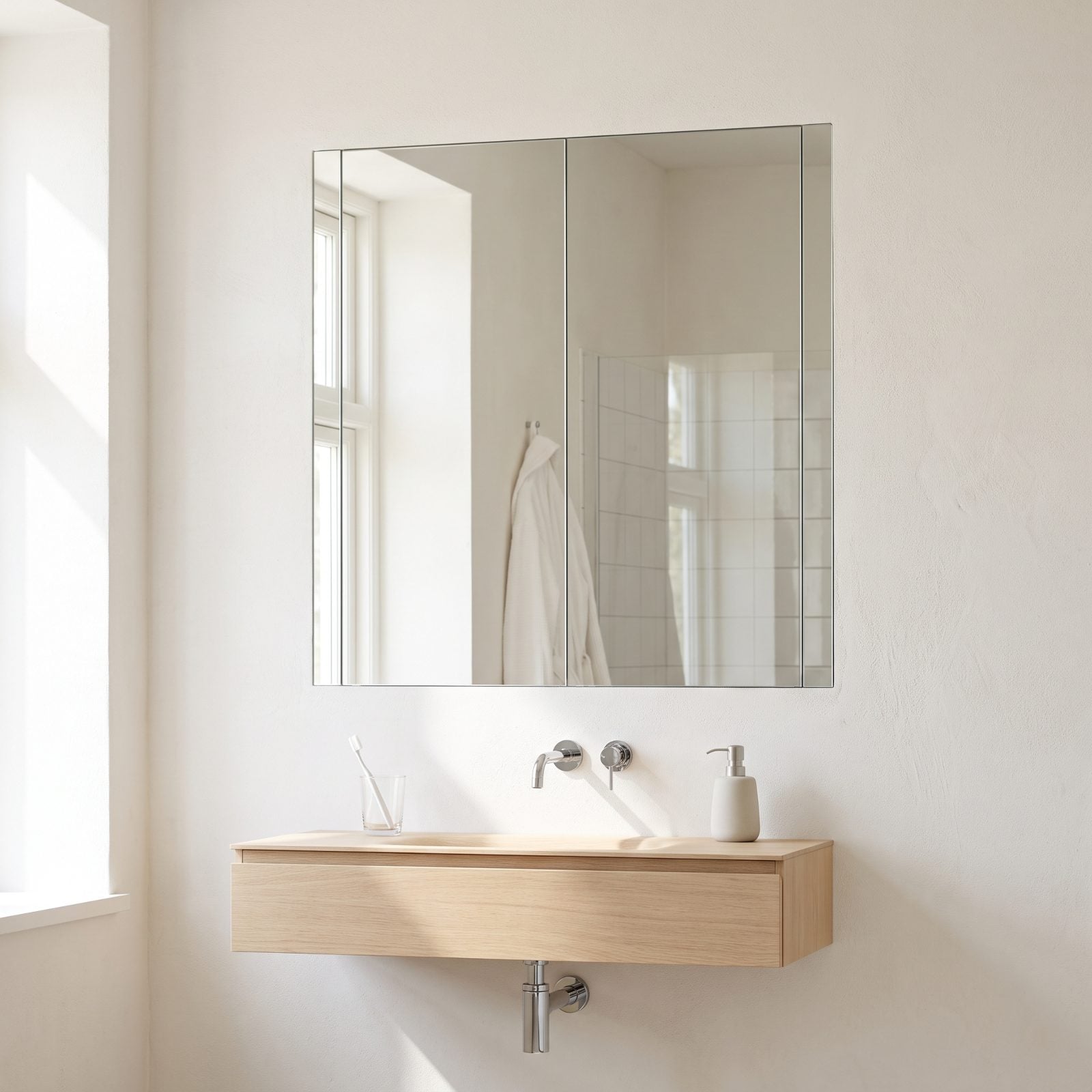
A surface-mounted cabinet sticks out four or five inches and casts a shadow across your face. A recessed one lives inside the wall, flush with the surface, invisible as storage. You get the shelves without the box hanging into the room.
Build it between the studs and the mirror front sits dead flat. The reflection runs clean — no bulky frame, no projecting ledge, no bumped elbows. It’s one of those fixes you never notice when it’s done right, which is exactly the point.
24. An Integrated Sink Wipes Out the Seams Entirely
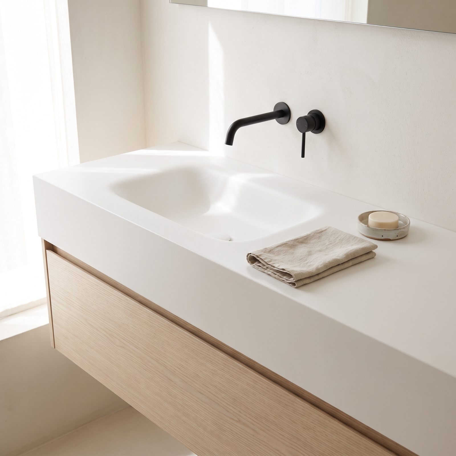
Count the lines on a normal sink setup: the rim of the basin, the caulk joint, the backsplash seam, the edge of the counter. Each one is a little visual stop. An integrated sink, molded from the counter in a single piece, erases almost all of them.
The eye slides across one unbroken surface and reads it as larger and calmer than a counter chopped up by edges. Fewer seams also means fewer grimy lines to scrub, which in a hotel is half the reason they spec it in the first place. A quiet surface makes a small room feel settled rather than cramped.
23. A Toilet Tucked Behind a Vanity Gains Privacy Without a Full Wall
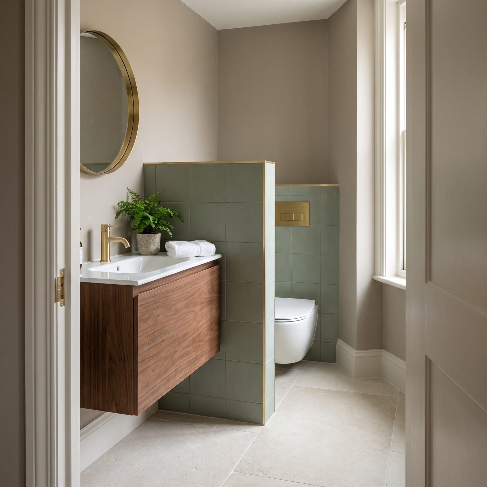
The full wall around a toilet is where small bathrooms go to die. It chops the floor into two sad little boxes and blocks every bit of borrowed light. A half-height partition handles the privacy job without that cost.
We took one cramped city bathroom and swapped its floor-to-ceiling divider for a shoulder-high return wall off the vanity. Suddenly the eye traveled the full depth of the room again, and daylight cleared the top of the screen instead of slamming into drywall.
Keep the partition thin and stop it below the ceiling line. Tile both sides to match the vanity wall and it reads as built-in furniture rather than a cheap afterthought.
22. Wall Tile Taken to the Ceiling Stretches the Room Upward
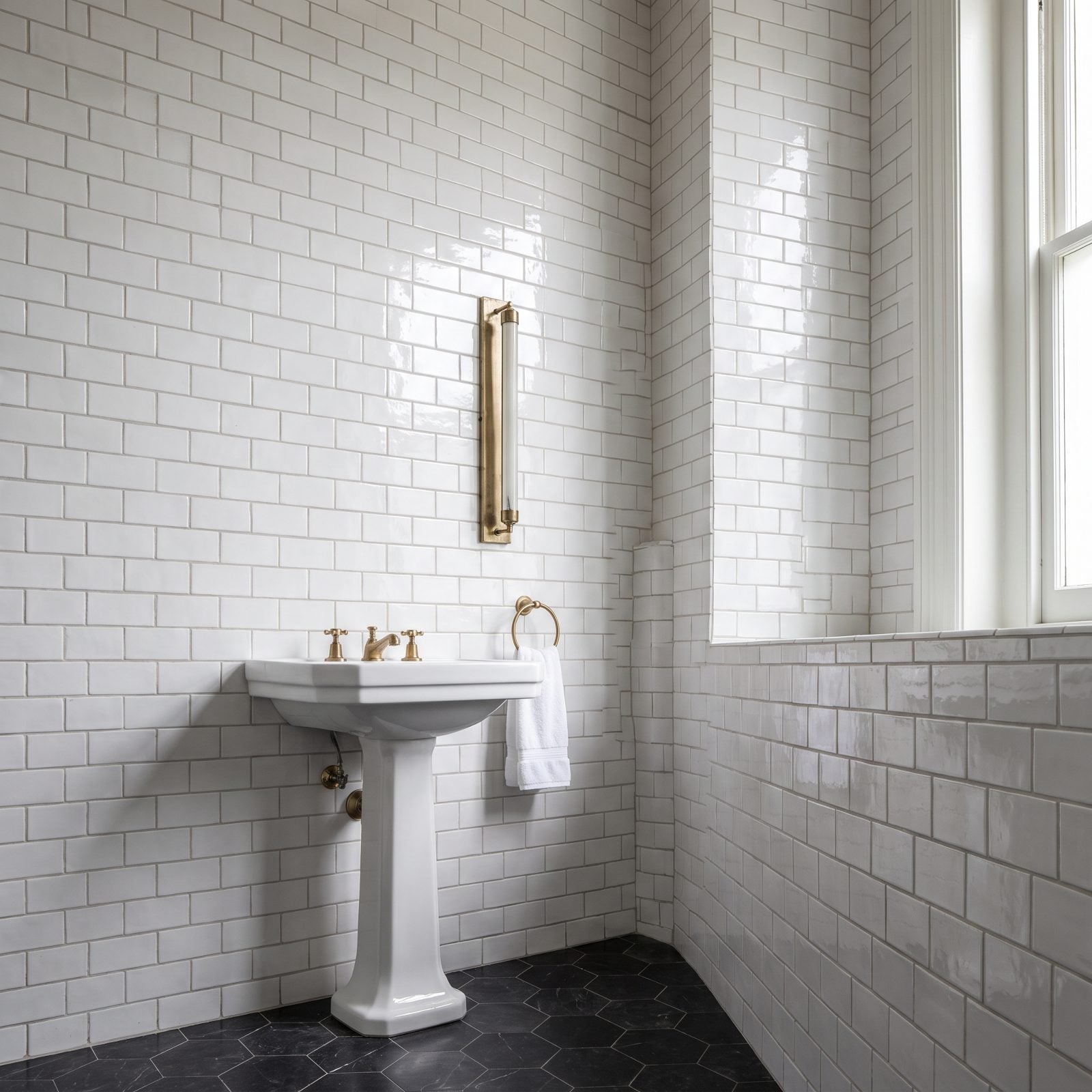
Stop the tile at four feet and you draw a horizontal line the eye can’t unsee. The room gets a ceiling it never asked for, sitting right at your shoulders.
Run that same tile all the way up and the walls become one tall, unbroken surface. No cut line tells your brain where to quit looking, so it keeps climbing until it reaches the real ceiling. Heritage hotels have known this forever, which is why those old white-tiled baths feel like cathedrals compared to their square footage.
Skip the contrasting border strip. A border is just a short wall painted on, and the whole idea here is to delete lines, not install decorative ones.
21. Horizontal Tile Placement Makes a Narrow Bathroom Look Wider
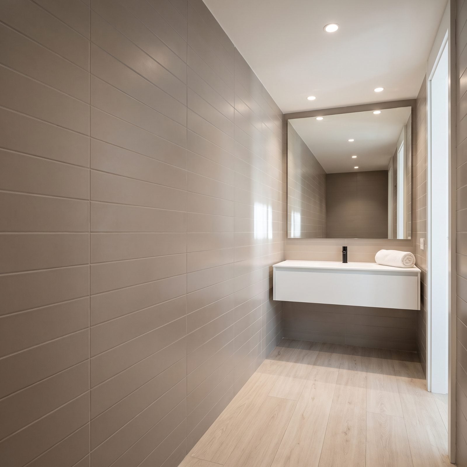
Narrow bathrooms have a width problem, and most people fix the wrong direction. Vertical tile makes a tall room taller when what you actually need is breadth.
Lay the tile horizontally along the long wall and the grout lines run with the room, tugging your eye sideways and reading as wider than the tape measure allows. We tested this across a few galley-style layouts, and the horizontal setting won every time once the bathroom dropped under four feet wide.
20. A Monochromatic Palette Blurs the Room’s Edges
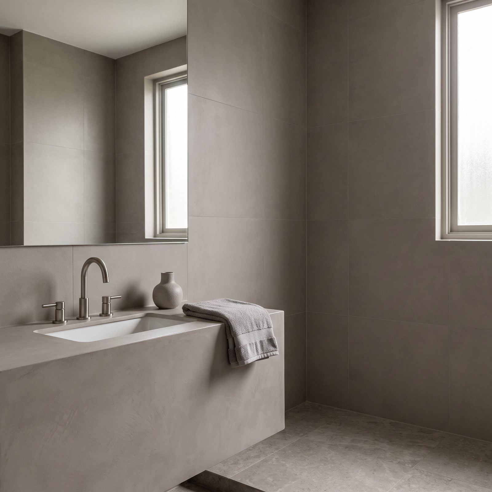
Corners are where small rooms confess their size. Every time the color changes at an edge, your eye quietly measures the box.
Keep walls, floor, and vanity in one tonal family and those corners soften into suggestion. The brain stops clocking boundaries, and the room seems to breathe past its actual limits. We gave one windowless resort bath the single-tone treatment, and the thing felt nearly a third bigger than its twin down the hall. Same footprint, just more contrast in the other.
Vary the texture, not the hue. Matte wall against honed floor against a plaster vanity keeps it from going flat and clinical. Same color, different hands touching it.
19. Glossy Wall Tile Bounces Light Into Dark Corners
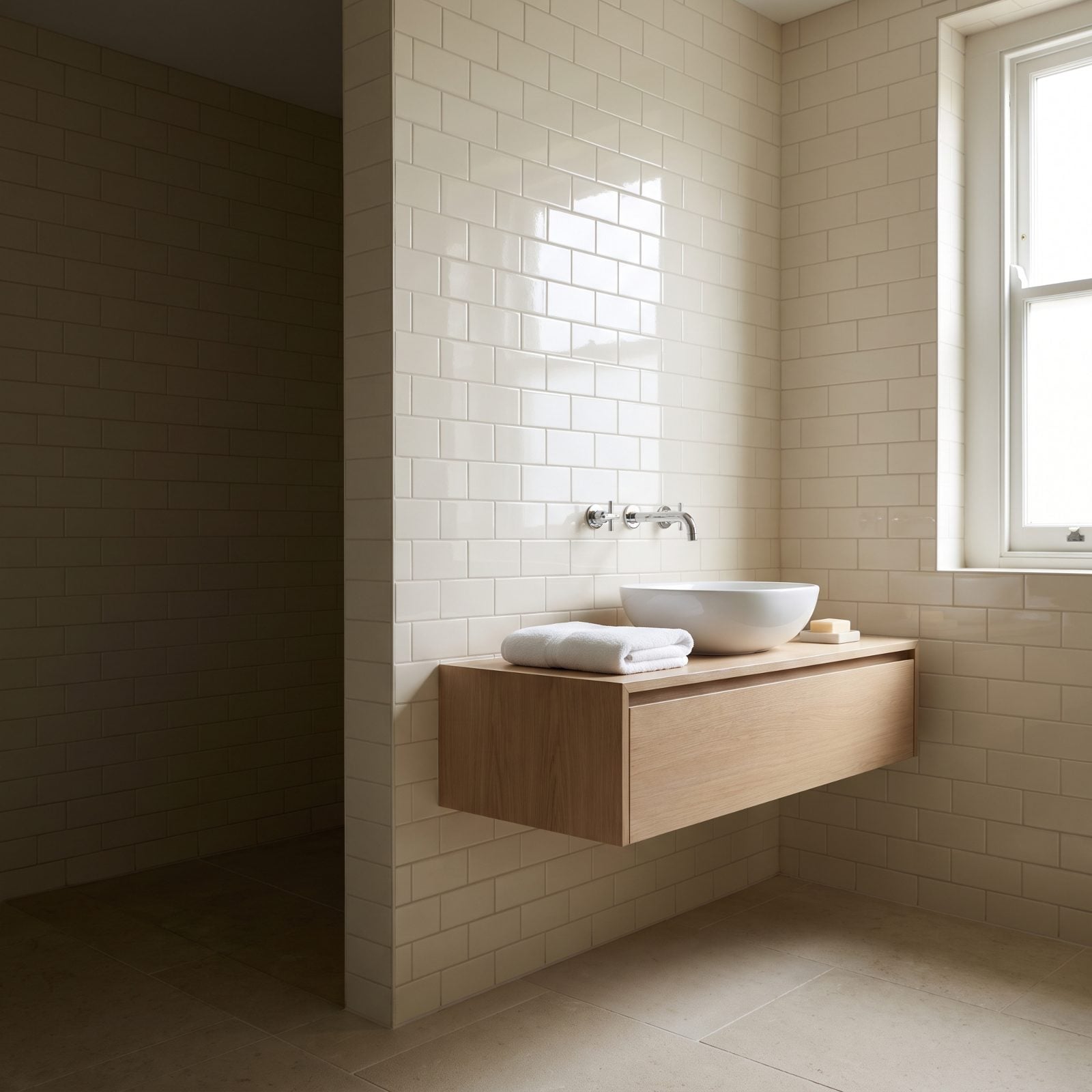
A matte wall drinks light. A glossy one passes it along.
In a bathroom with one small window, high-gloss tile turns every surface into a second light source, carrying daylight into the far corner that would otherwise sulk in shadow. The brighter the back wall, the deeper the room appears, because gloom at the edges is what makes a space feel like it’s closing in on you.
Here’s the catch the showroom skips: gloss shows every water spot and streak. In a hotel that’s housekeeping’s problem. At home, keep a squeegee by the sink or the whole effect dissolves into smudge by week two. I learned that the hard way with a wall of black gloss tile that looked incredible for exactly nine days.
18. One Dark End Wall Adds Convincing Depth
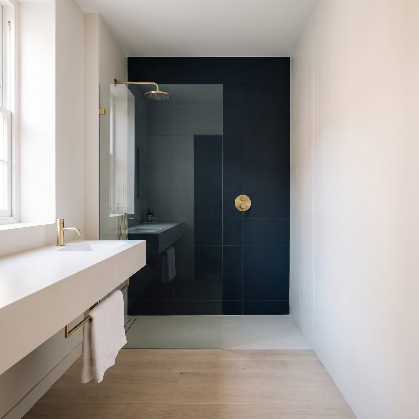
Everyone whispers the same advice to small rooms: paint it all white, stay out of its way. Mostly good counsel. Mostly.
Paint the far short wall a deep charcoal or navy and watch it step backward. Dark colors recede, so the end of the room reads as farther off than it is, and the pale side walls frame that depth like a corridor leading somewhere. We tried this on a stubby bathroom where every white scheme turned it into a shoebox. One dark end wall, and it finally had a horizon.
A small room doesn’t need to hide its size. It needs somewhere for your eye to travel.
17. Warm White Walls Keep a Windowless Bathroom Bright
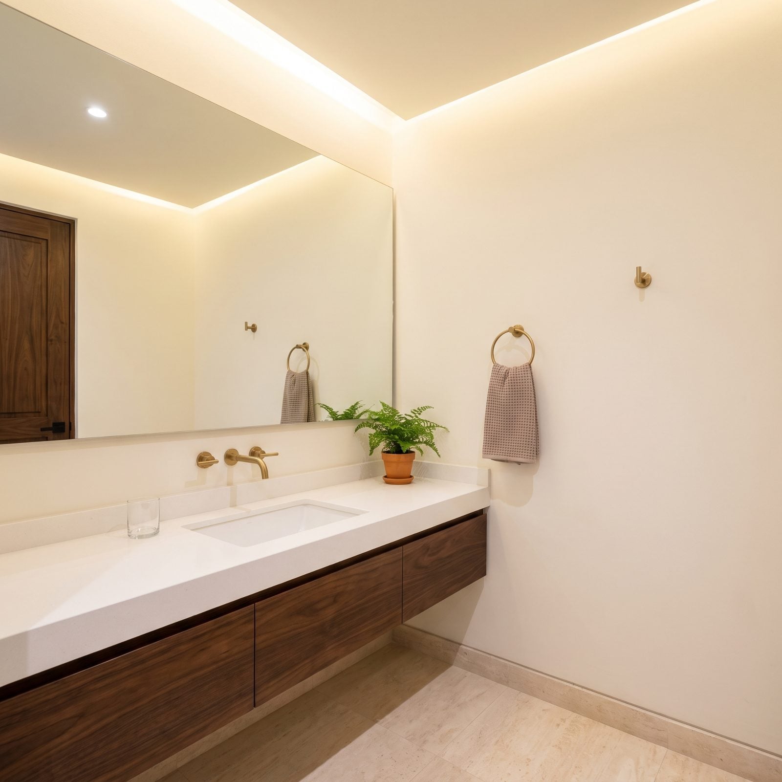
Cool white is the classic blunder in a room with no daylight. Under a bulb it goes grey and faintly morgue-like, and no amount of fancy tile rescues it.
Warm white, the kind with a whisper of cream or taupe under it, holds its brightness when a bulb is the only light in the room. It reflects the warm cast of LED or halogen instead of fighting it, so the space reads bright and welcoming rather than bunker-cold.
16. A Frosted Window Adds Light Without Sacrificing Privacy
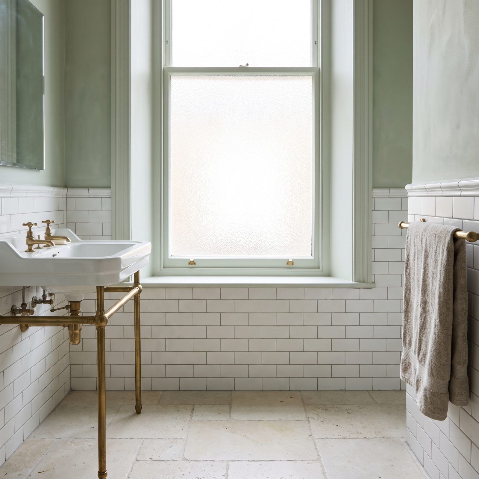
Clear glass in a ground-floor or courtyard bathroom means blinds, and blinds mean a window you keep shut. All that daylight, wasted behind a drawn shade.
Frost the glass and the window earns its keep full time. The pane scatters light into a soft even wash instead of a hard beam, and that fills a small room better than clear glass ever managed, with no privacy trade at all. Old hotels leaned on textured reeded and frosted panes for exactly this reason, and those bathrooms still glow at four in the afternoon.
Film is the cheap route if you’re stuck with clear glass. It peels eventually and bubbles at the edges, but it buys you years before you spring for the real thing.
15. A High Clerestory Window Leaves Walls Free for Fixtures
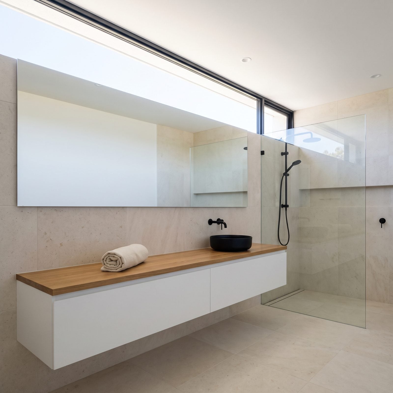
A normal window at eye level eats the one wall you most need for a mirror or a tall cabinet. In a small bathroom that’s a real loss.
Run the window high instead. A clerestory strip just under the ceiling gives you the daylight without surrendering the wall: light drops from above where it’s flattering and even, the whole lower wall stays open for fixtures, and that high band of sky pulls your eye straight up.
14. Perimeter Cove Lighting Makes the Ceiling Appear to Float
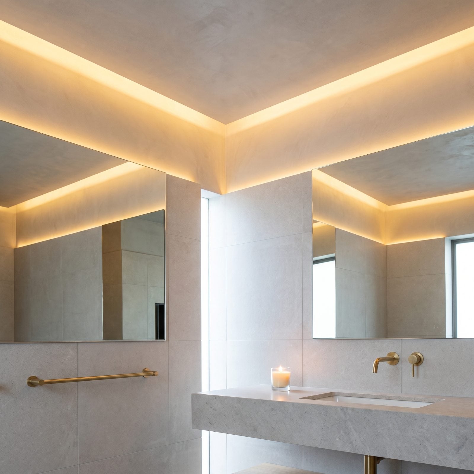
A small ceiling feels closest in the corner, right where it crashes into the wall over your head.
Tuck a warm LED strip into a recessed channel around the perimeter and wash the ceiling with light from its own edges. The corner joint fills with glow instead of shadow, and the whole ceiling seems to detach and hover a few inches higher than it really sits. We added cove lighting to a low-ceilinged bath and guests kept guessing it was taller than it measured. Every time.
Keep the strip warm, around 2700K, and dimmable. Cool cove light looks like an office, and nobody wants to feel audited while they brush their teeth. Alright, go measure your ceiling channel before you fall in love with this one.
13. Vertical Sconces That Pull the Eye Toward the Ceiling
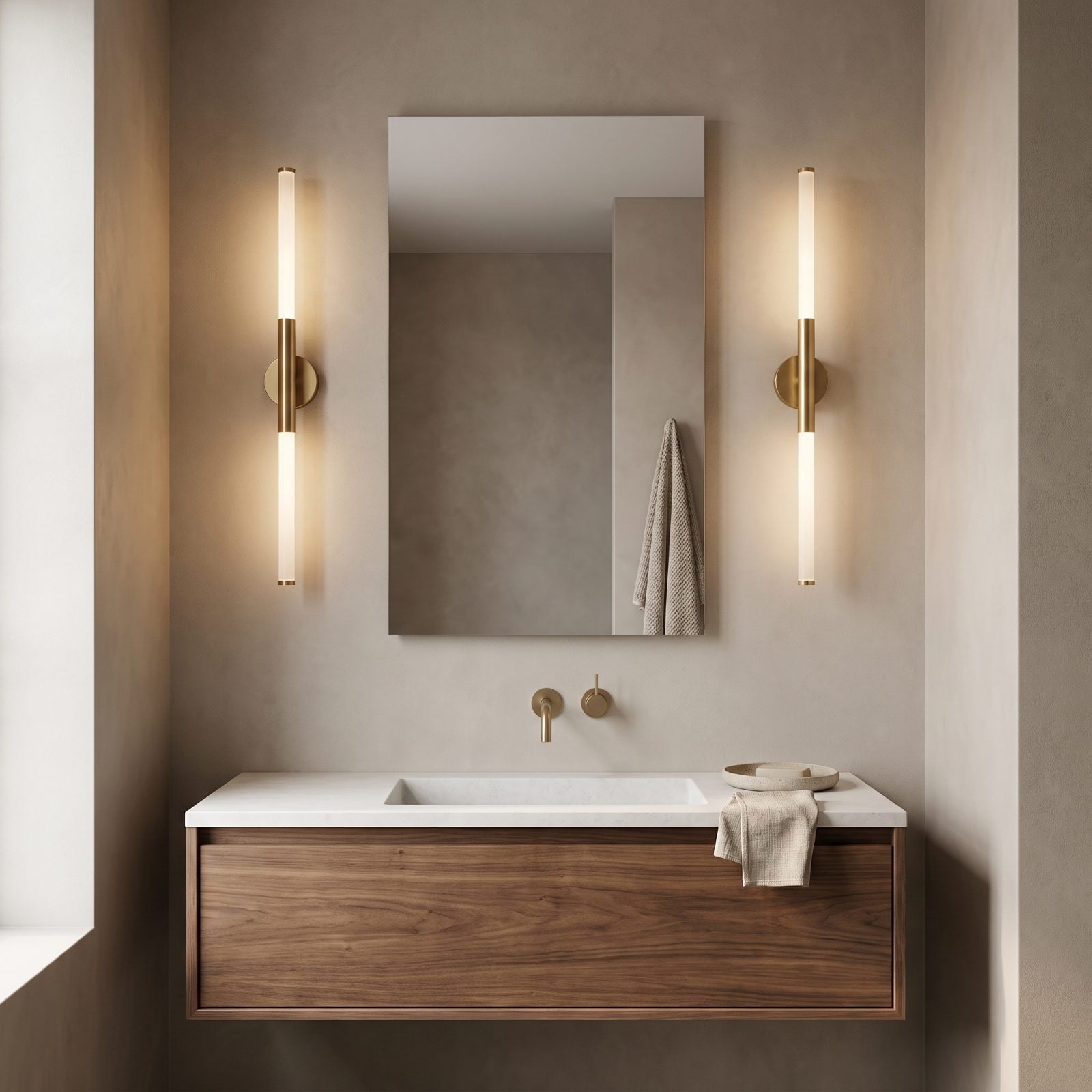
Hang a light horizontally and you cut the wall in half. Hang it vertically and you stretch it. That’s the whole secret behind those slim brass vertical sconces flanking a hotel mirror. The eye follows a vertical line to its end, and when that line points up, the ceiling feels further away than it is.
We’ve tested this against the usual over-mirror bar light. The bar light is fine for shaving, but it does nothing for the room. A pair of tall columns does both jobs and makes the wall look like it was built for a taller space.
12. Under-Vanity Lighting That Reveals More Floor
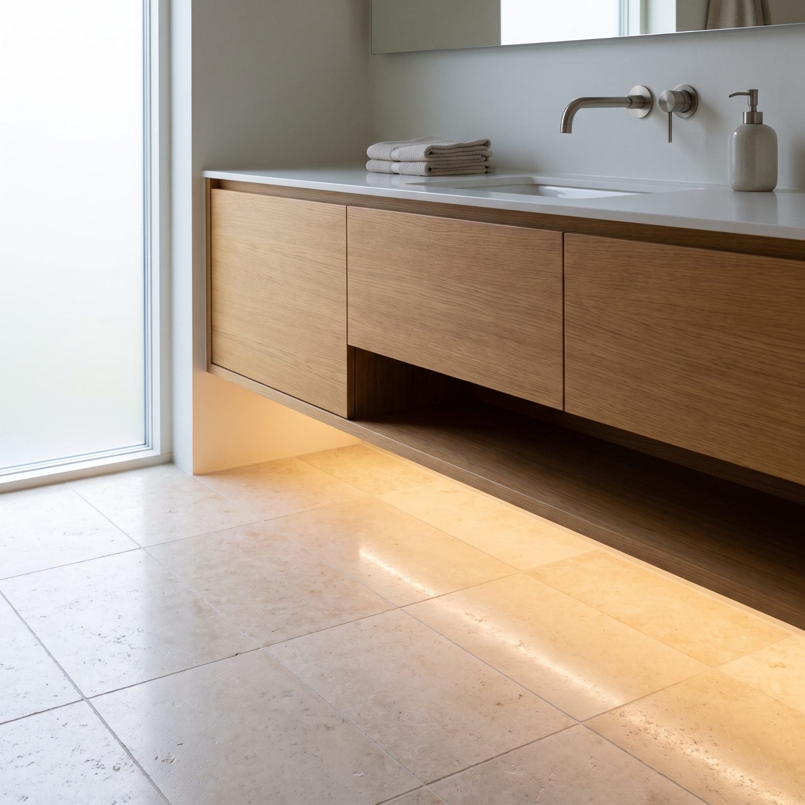
A floating vanity already helps. Tuck a warm LED strip underneath and you’ve pulled off a small sleight of hand: the light spills across the floor and keeps going into the shadow beneath the cabinet, so your brain reads the floor as running on, uninterrupted.
Visible floor equals perceived space. Every square inch you hide behind a bulky cabinet base is square footage you’ve paid for and can’t see. We gave a dim city bathroom this exact treatment and the floor instantly looked a third bigger. The cost? A strip light and someone who knows where the outlet is.
11. Recessed Ceiling Lights That Leave the Air Clear
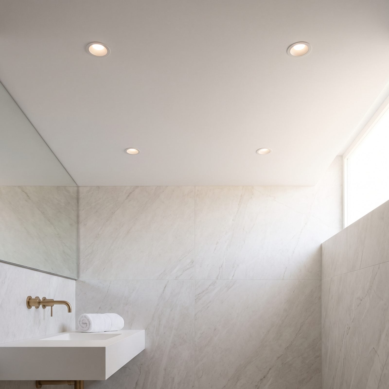
Anything dangling from the ceiling steals height. A pendant, a flush drum shade, even a decorative fan — each one plants an object in the airspace and tells your eye the ceiling stops there.
Recessed downlights sit flush and disappear, leaving the ceiling as one clean plane. That’s exactly what a small room needs. And I’ll die on this hill: a pretty pendant in a tiny bathroom is vanity working against function. Save it for a room with ceilings to spare.
10. A Lit Recessed Shower Niche That Carves Out Depth
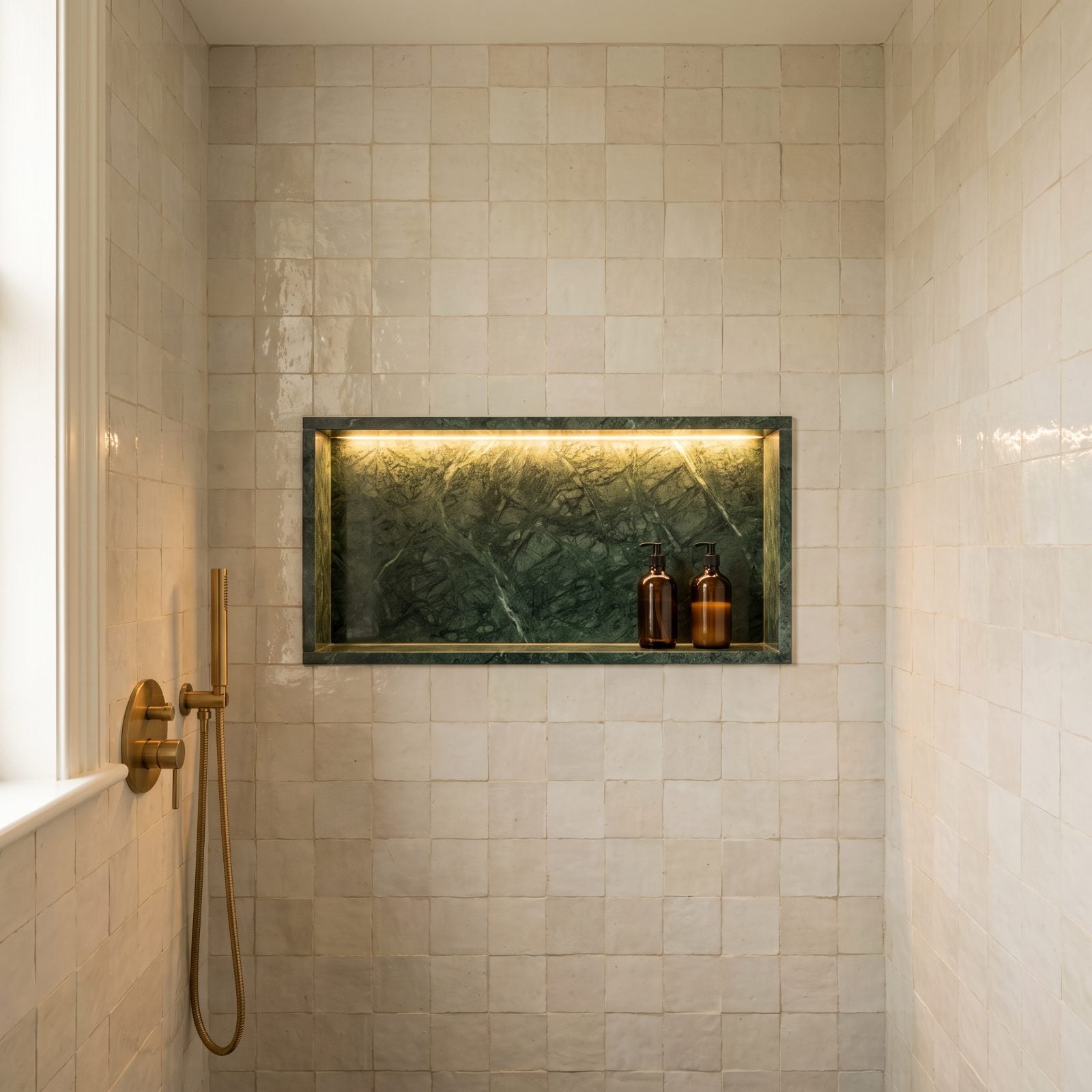
A shelf bolted to a shower wall juts into the space and collects grime behind it. A recessed niche does the opposite. It digs backward into the wall and gives your bottles a home without eating a single inch of standing room.
Run a thin warm LED along the top edge and the niche turns into a pocket of glowing depth. The wall stops being flat. The eye gets somewhere to travel. We lined one in dark green marble against pale tile and it became the best feature in a room the size of a closet.
9. Wall-Mounted Faucets That Hand the Counter Back to You
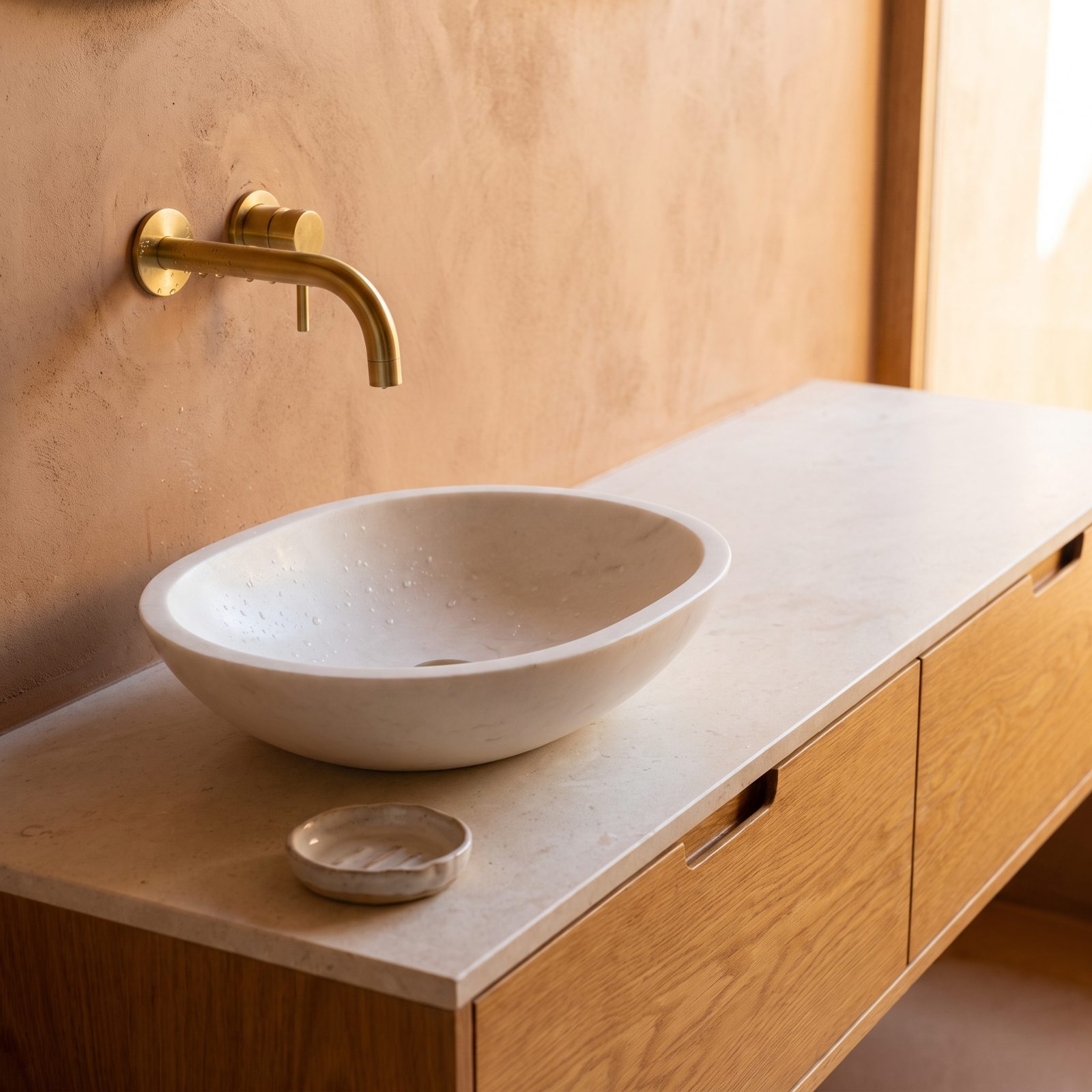
Watch what a deck-mounted faucet actually does to a counter. It plants a tall fixture dead center, then surrounds itself with a wet splash zone you can’t put anything on, and just like that you’ve lost the whole back half of your surface.
Move the brass wall-mounted faucet onto the wall and the counter opens up flat and clear. More visible surface reads as more room, every time. The install is fussier, the plumbing lives inside the wall, but a hotel that does this always feels more considered the second you walk in.
8. A Ceiling Rain Shower That Clears the Wall Completely
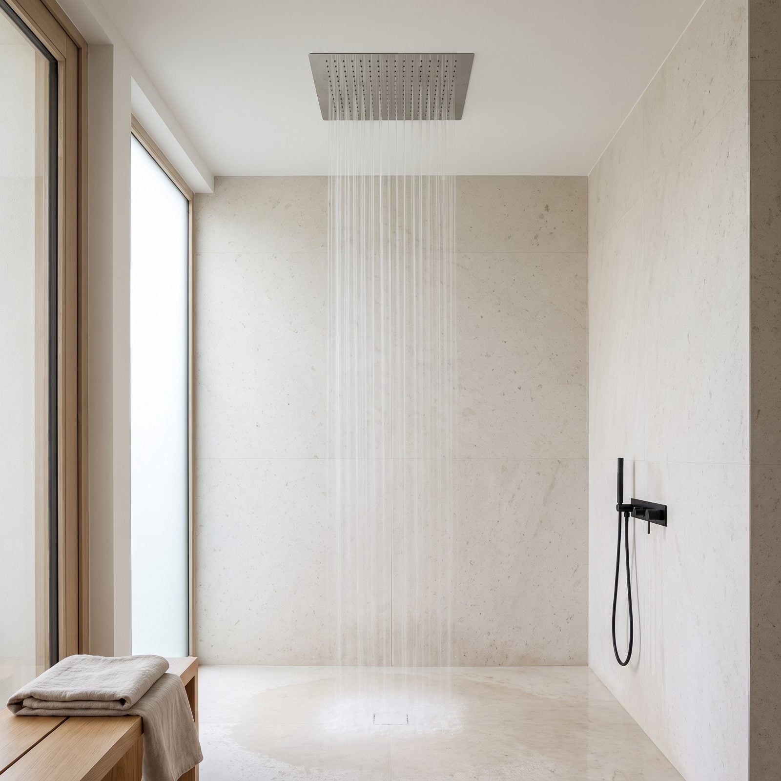
A wall-mounted shower head sticks out on an arm, and your eye snags on it the moment you step in. A ceiling-mounted rain head sits flush and leaves the wall as one unbroken surface.
That clean wall is doing quiet work. Nothing interrupts the vertical run of tile, so the shower reads taller and the whole enclosure feels less like a box full of fixtures. Water falling straight down also feels luxurious in a way that has nothing to do with square footage and everything to do with restraint.
7. A Heated Towel Rail That Retires Four Other Accessories
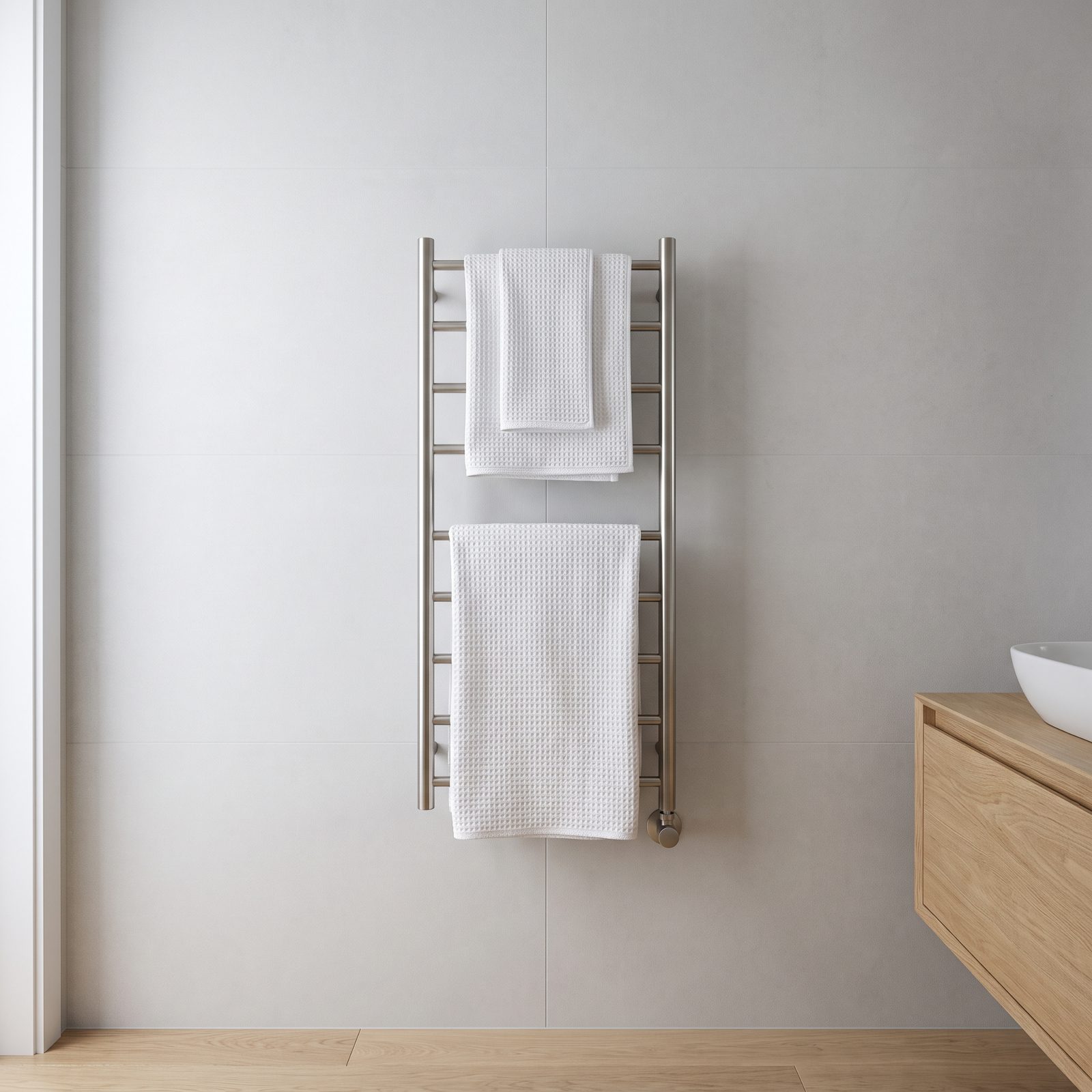
Count the clutter one towel rail eliminates: the hook for the hand towel, the ring by the basin, the floor rack that was always in the way, the shelf nobody dusted. One slim heated bar replaces the lot.
Fewer objects on the wall, calmer wall, bigger-feeling room. The warmth is a bonus. The real gift is subtraction. A heated rail is that rare fixture that earns its spot by removing three others.
6. A Wider Doorway for a Bigger First Impression
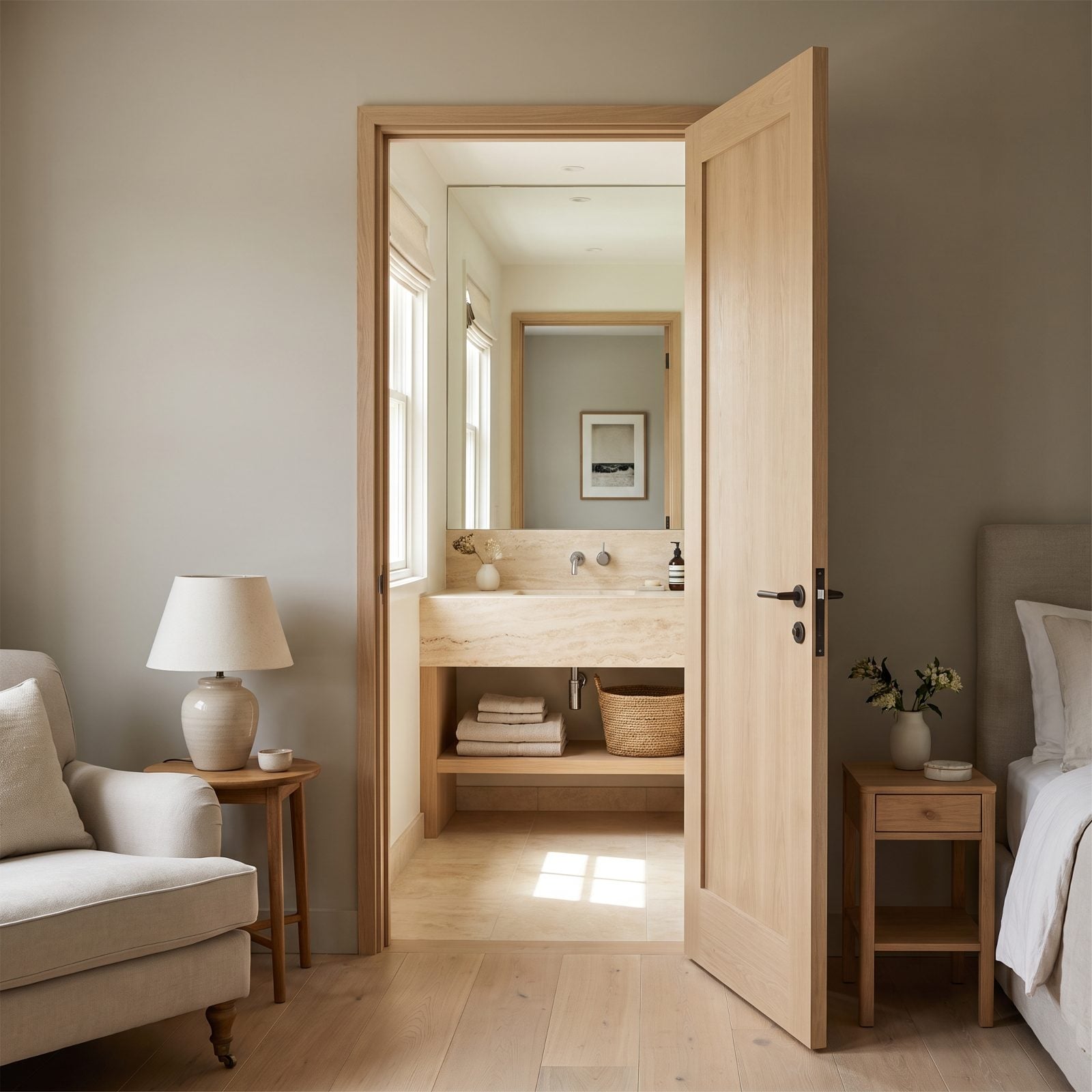
The first thing a small bathroom tells you is the width of its doorway. A narrow opening says cramped before you’ve even stepped through. A wide one says come on in.
We widened a pinched doorway on one compact bathroom and the measured floor area didn’t change by a single inch. The felt area changed entirely. Light and sightline now flow in through a generous aperture, so the bathroom reads as part of the room it opens from instead of a sealed box tacked onto the side.
5. Handleless Cabinets That Keep the Lines Unbroken
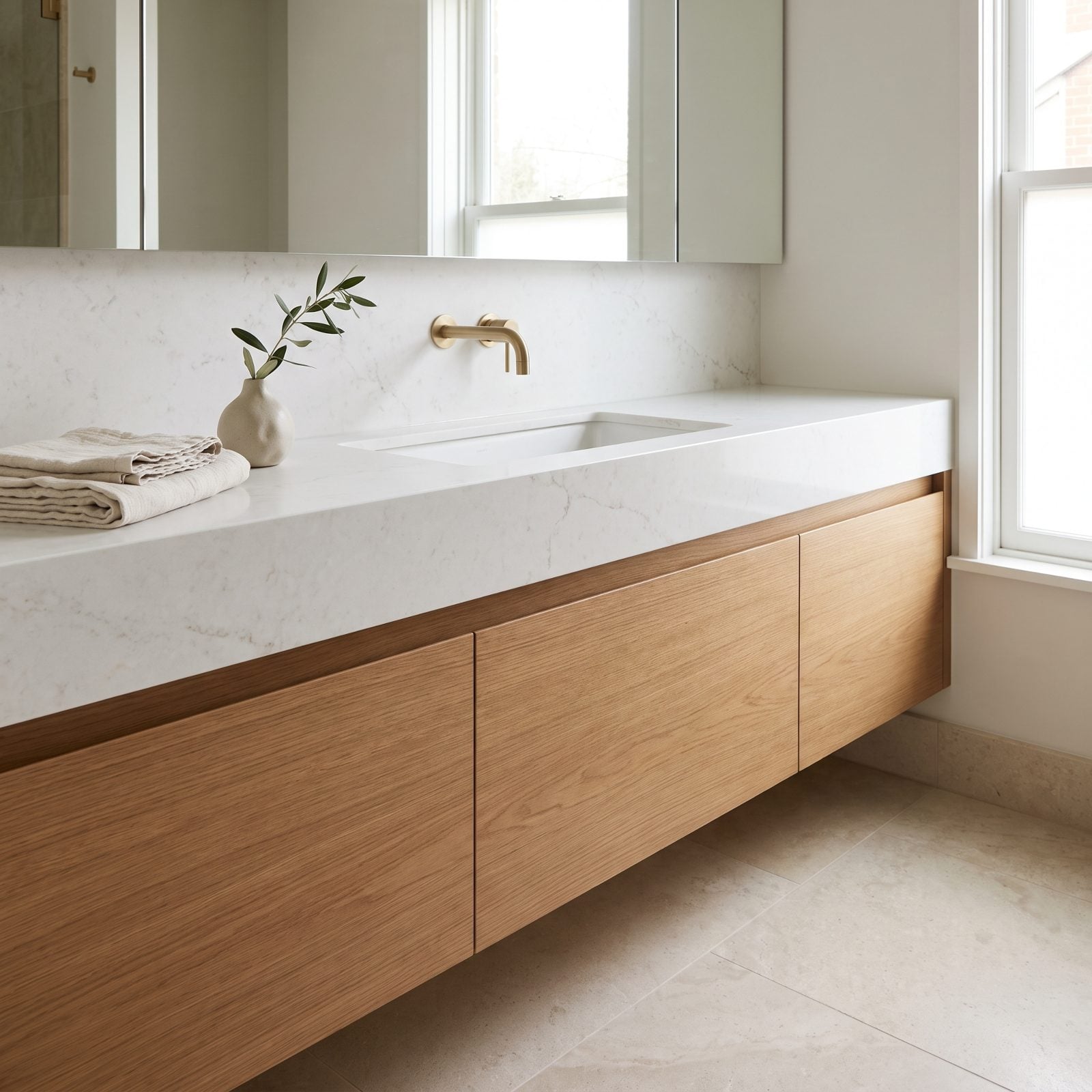
Handles chop a cabinet front into pieces. Your eye catches on every knob and pull, and all that visual stopping makes the run feel shorter than it measures.
Go handleless, push-to-open, and the fronts become one clean plane. The horizontal line runs the full length uninterrupted, and a long unbroken line always reads wider than a busy one. The matte oak handleless vanity pulls the same trick a good tailor does with a vertical stripe — stretching what’s there without adding anything.
4. A Linear Drain That Lets the Floor Run as One Piece
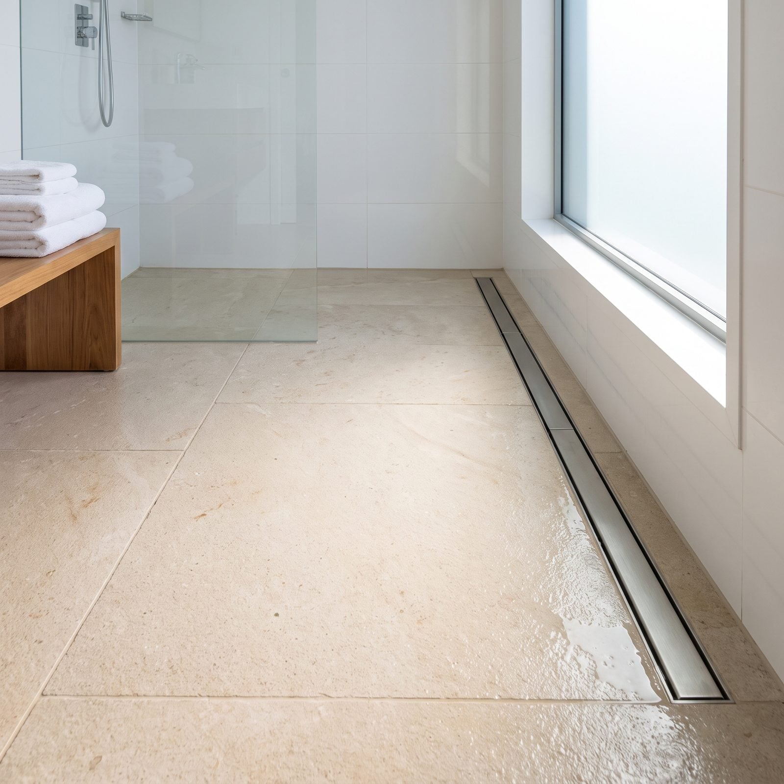
A center drain forces the floor to slope toward it from four directions. Four little tilts, awkward tile cuts, a chopped-up surface. A linear drain changes the math entirely.
Put the slot along one wall and the whole floor slopes in a single direction as one continuous plane. You can run big-format tile straight through, no mosaic of tiny pieces fighting the pitch, no threshold to step over. The floor flows from the bathroom into the shower in one sweep, and honestly, that’s the single strongest move on this whole list for making a small floor feel large. Go try it in the next decent hotel you book. You’ll feel the difference before you can name it.
3. Wall-Mounted Shower Dispensers Clear the Ledge and Open the Line of Sight
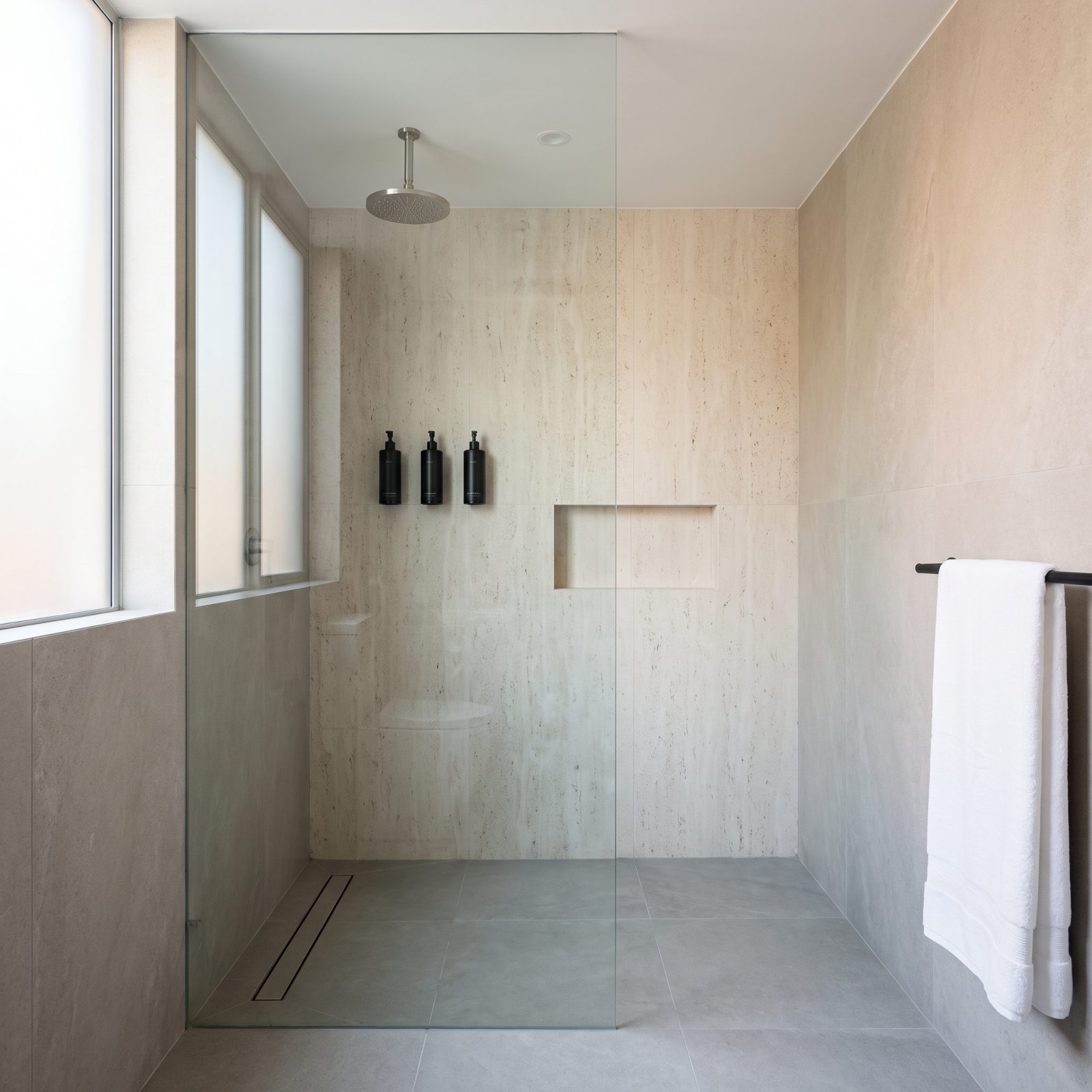
Count the bottles on your own shower shelf right now. Four? Six? Every one of them casts a shadow and breaks the wall into clutter, and your eye reads all that busyness as a small, cramped room. Hotels figured this out years ago.
Fixed matte black wall dispensers do one quiet thing. They hand the shower wall back to the wall. An uninterrupted plane reads as more surface, and more surface reads as more room, so the eye travels without hitting speed bumps.
We’ve stayed in showers you could barely turn around in that somehow felt generous, purely because the walls were clean. Three pumps, flush-mounted, done. Nothing perched, nothing tipping over, nothing waiting to clatter into the drain at six in the morning.
2. A Near-Bare Vanity Top Lets the Negative Space Do the Heavy Lifting
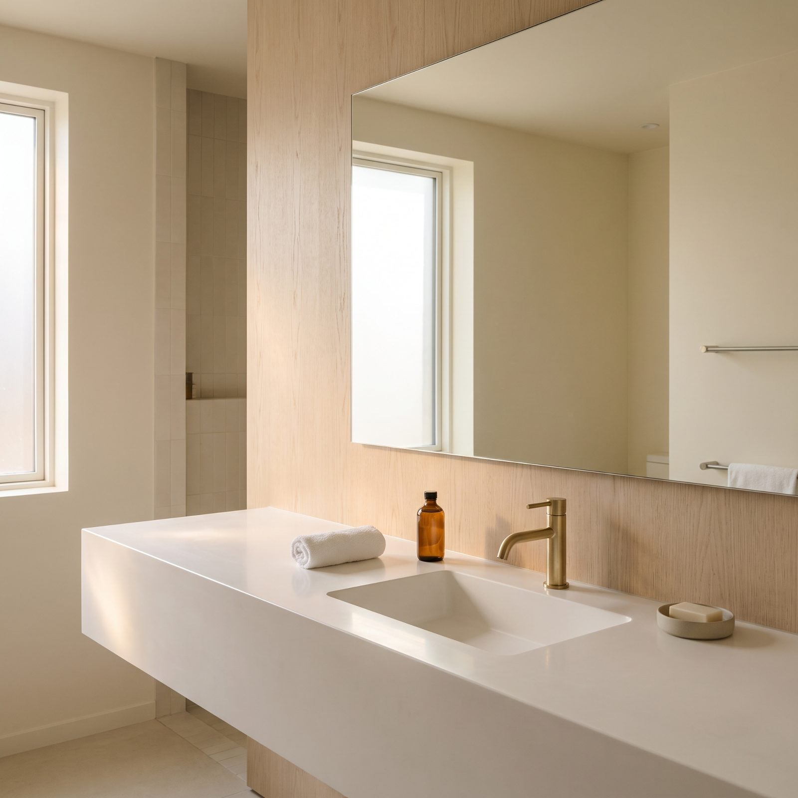
Empty space is not wasted space. It’s the most expensive-feeling thing a small bathroom can own, and it costs nothing.
The instinct is to fill a counter, because filled looks furnished. Wrong. A vanity buried under bottles, trays, and a tissue box in one of those quilted covers your grandmother kept reads as cramped no matter how big the room actually is. Leave three things on the stone and the counter suddenly looks twice as long.
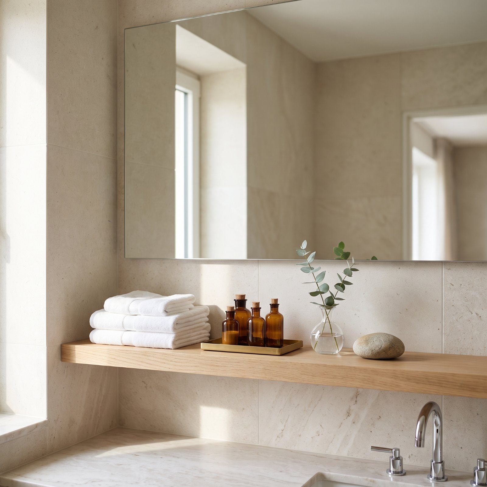
One amber glass dispenser, a single low ceramic tray, a rolled towel. That’s the whole arrangement in the hotels that understand this, and everything else lives behind a mirror or down in a drawer.
Hide the storage, show the stone. I’ve measured counters that were genuinely tiny and would’ve sworn on anything they weren’t.
1. A Tub Positioned Toward a Window Dissolves the Walls Entirely
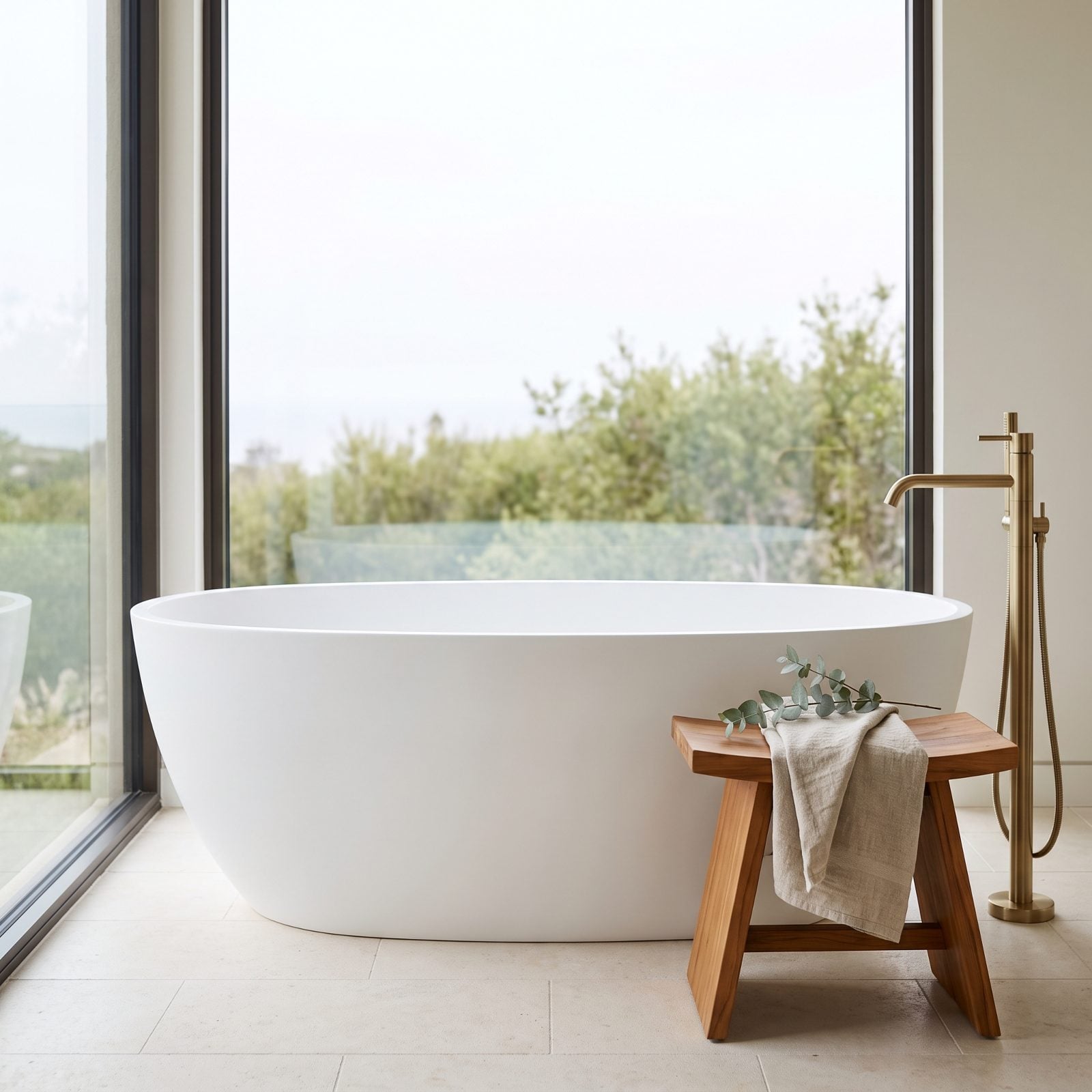
Put a bathtub in front of a window and the wall stops existing. Your eye runs past the glass, out to the trees or the skyline, and the brain quietly adds all that distance to the room. Borrowed scenery, free of charge.
This is the oldest move in the book and still the strongest. A tub floated near a floor-to-ceiling window tells you the bathroom ends where the horizon does, not where the tile stops. Even a modest soaking tub feels boundless when it has somewhere to point.
We’ve seen compact resort bathrooms outperform sprawling suites on the strength of a single window. The water catches the daylight, the view bounces back off the surface, and the whole thing opens up.
A wall stops the eye. A window keeps it moving. The room you can see out of always feels bigger than the one you can’t.
If there’s a view, aim the tub at it. No view? Aim it at the brightest glass you’ve got, because light reads as space too.
🔥 Would you like to save this?
Please note that some of the imagery in this article were created with the aid of AI image generators.